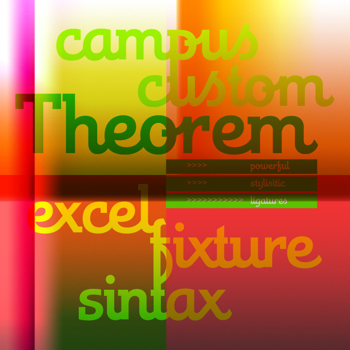
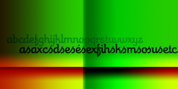
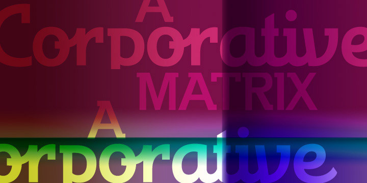
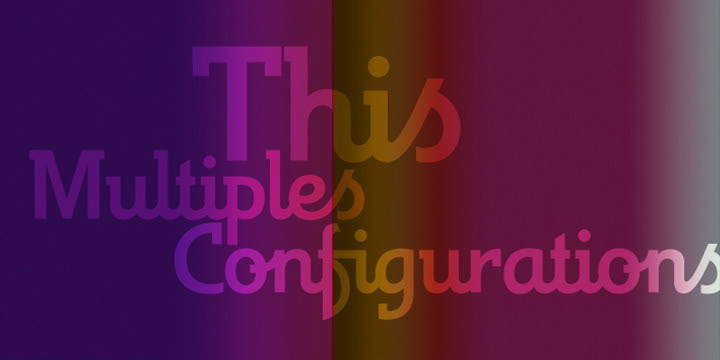
is an interesting change from the usual calligraphic work of Koziupa and Paul. An art deco font with a twist in its capitals, Theorem's lowercase characters were designed to automatically achieve the best optical spacing in typesetting. To accomplish that goal, a variety of alternates were drawn for most letters, and plenty of vowel-focused ligatures were designed. The auto-magic of OpenType ties it all together to a make a very versatile typeface that is quite useful for packaging and many different applications of display typography.