About «Esmeralda Pro»
From the beginning Esmeralda Pro was born with a strong influence of the classical «capitalis monumentalis», carved in stone. In the same way, the origin of this majuscule writing emerged from the brush, from a way of writing made merely by hand. For this reason, these two universes were intended to lie beneath the shape of each letter, redefining them. And this combination of styles should also be reflected in a lowercase set that also allows to open up the spectrum of usage possibilities. Foundational calligraphy represented a solid base for the development of lower case glyphs, ensuring proper interaction with the uppercase letters.
From the beginning Esmeralda Pro was born with a strong influence of the classical «capitalis monumentalis», carved in stone. In the same way, the origin of this majuscule writing emerged from the brush, from a way of writing made merely by hand. For this reason, these two universes were intended to lie beneath the shape of each letter, redefining them. And this combination of styles should also be reflected in a lowercase set that also allows to open up the spectrum of usage possibilities. Foundational calligraphy represented a solid base for the development of lower case glyphs, ensuring proper interaction with the uppercase letters.
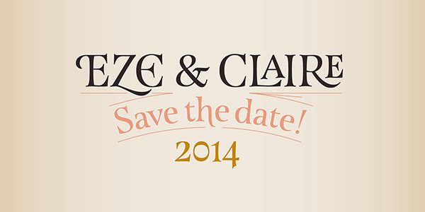
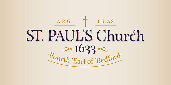
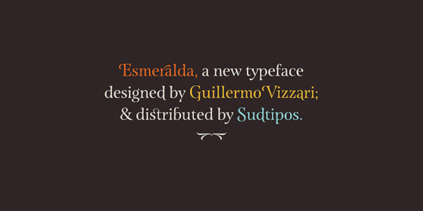
Esmeralda Pro features a great amount of ligatures that mix classic structures with a more contemporary impression. With more than eleven hundred glyphs, it provides a multiplicity of uses across a wide combinatory of ligatures, alternative signs, initial caps, miscellaneous and connectors; each one of them accessible through Opentype.
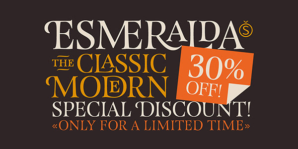
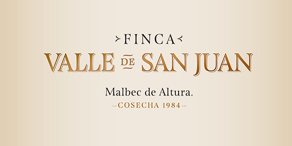
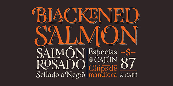
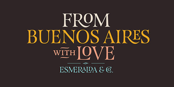
Esmeralda Pro is perfect to speak with a classical yet fresh, modern, –and a little bit bold– tone of voice.
Designed by Guille Vizzari, together with the tough and remarkable work of Ale Paul, «Esmeralda» –when in use– stands out in a subtle and unexpected way, almost unnoticeable. It’s delicate yet solid curves, serifs and endings give each composition a fine, elegant and exquisite feeling, along with a firm and sturdy look.
Designed by Guille Vizzari, together with the tough and remarkable work of Ale Paul, «Esmeralda» –when in use– stands out in a subtle and unexpected way, almost unnoticeable. It’s delicate yet solid curves, serifs and endings give each composition a fine, elegant and exquisite feeling, along with a firm and sturdy look.
_
License Esmeralda Pro


The «Esmeralda» project was initially born as a typographic project developed by Guillermo Vizzari –tutored by Ale Paul and Ana Sanfelippo– under completion of the Specialization in Typography Design at University of Buenos Aires, Argentina, during the years 2011 and 2012.
Now «Esmeralda Pro» is available here.
Now «Esmeralda Pro» is available here.