Saúde (cheers).
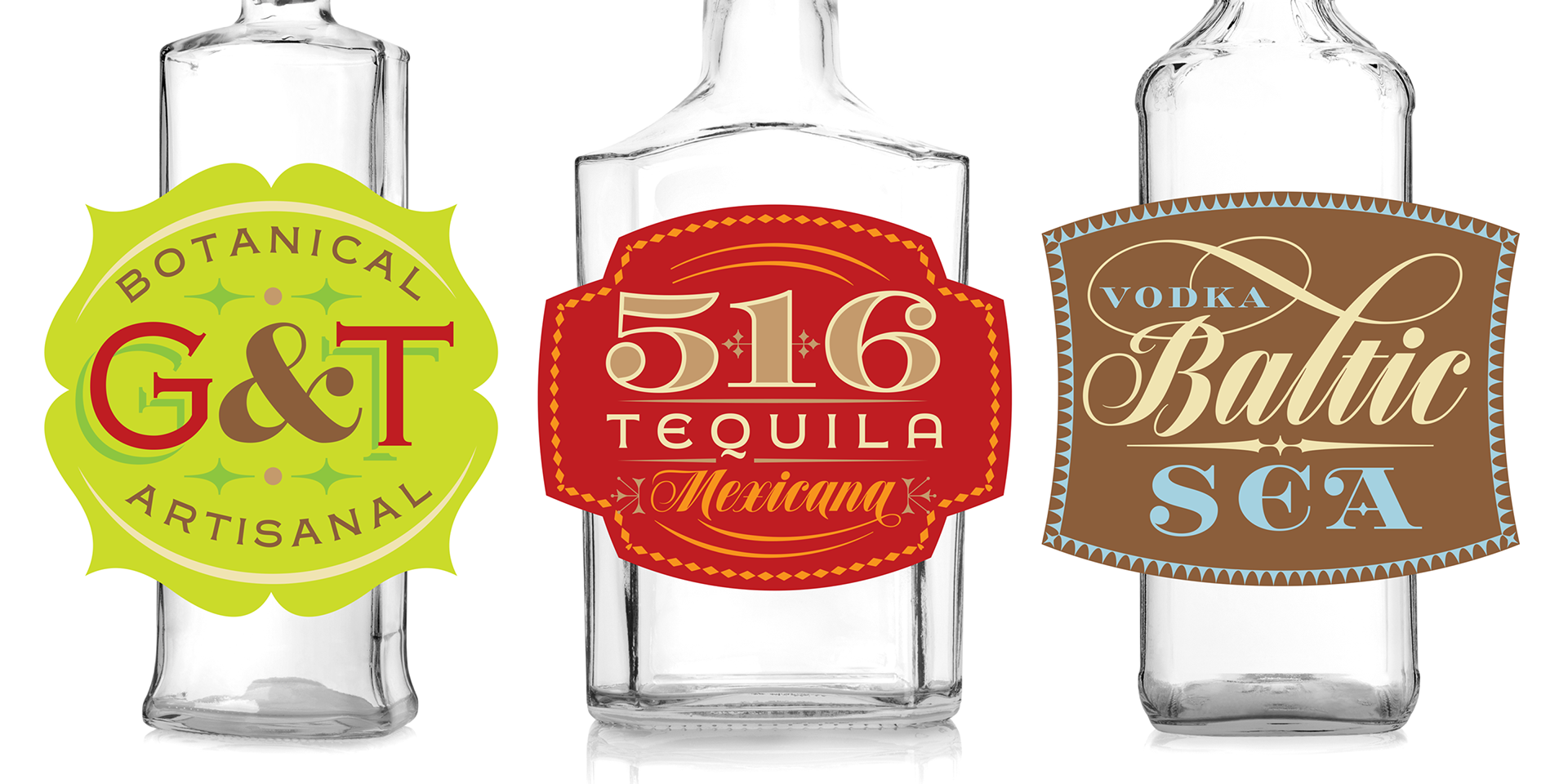
We have invited the renowned restaurant branding designer and Type Cooper West teacher Roberto De Vicq Cumptich to create some images with our newest "Speakeasy" set of fonts. Roberto is the Vice President at the Type Directors Club and he has roots in Brazil, maybe that explain his colorful approach!
About the fonts.
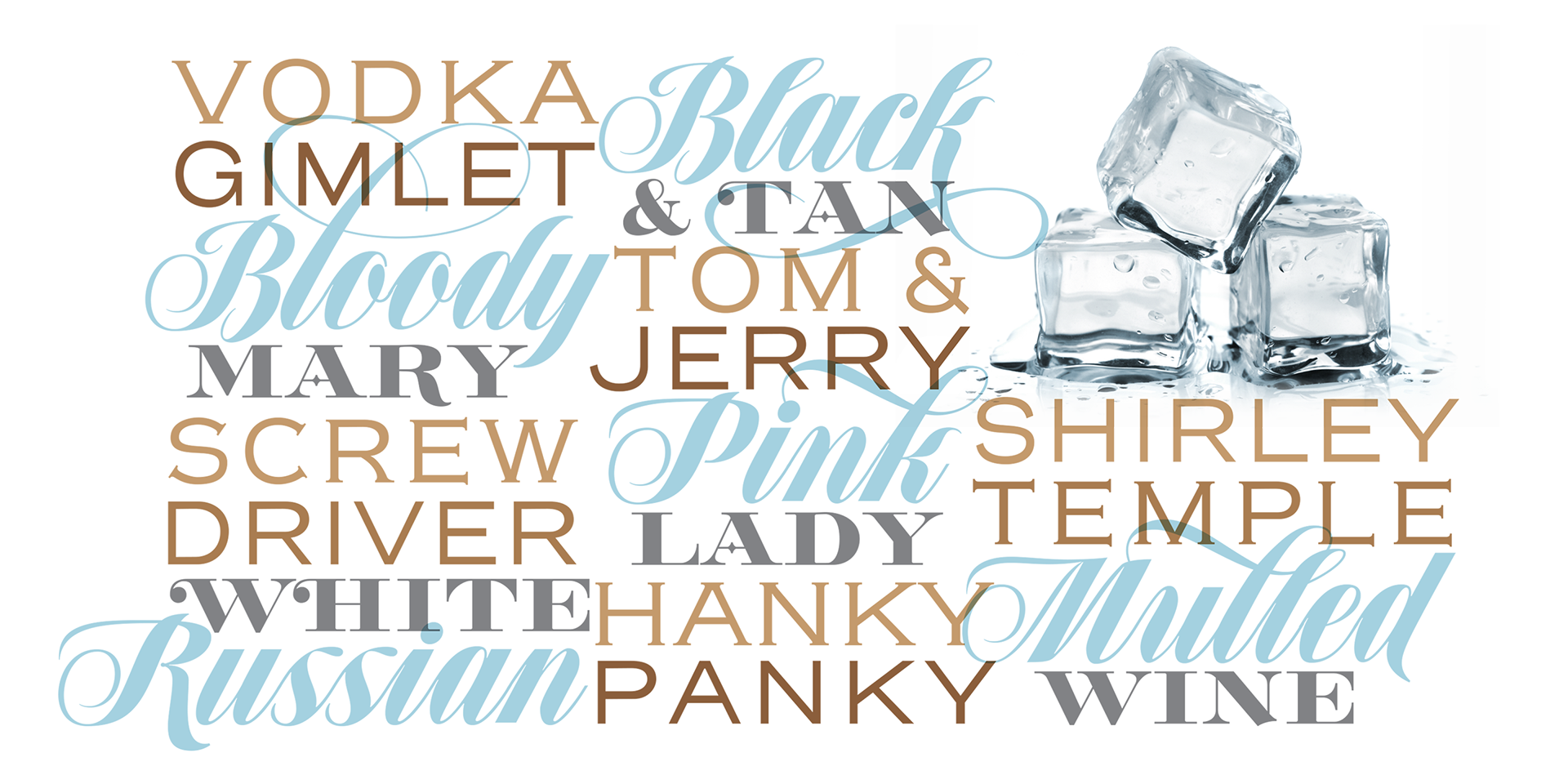
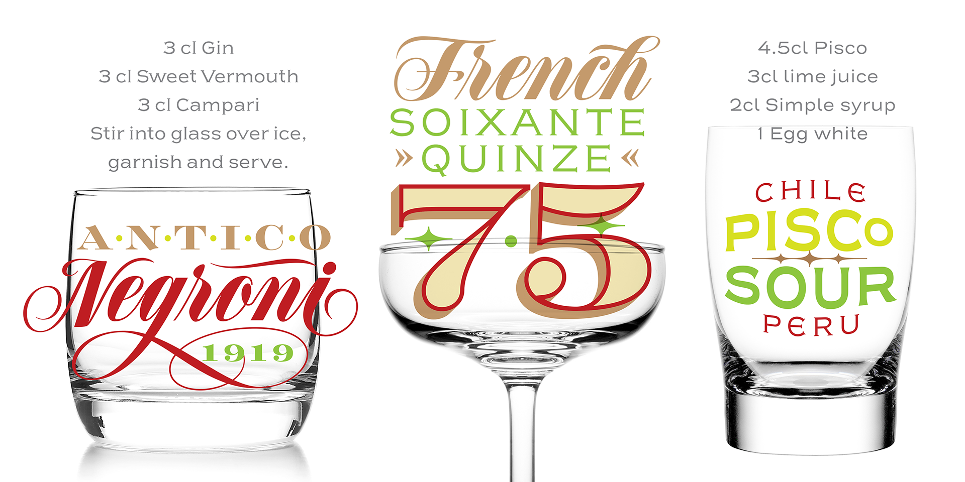
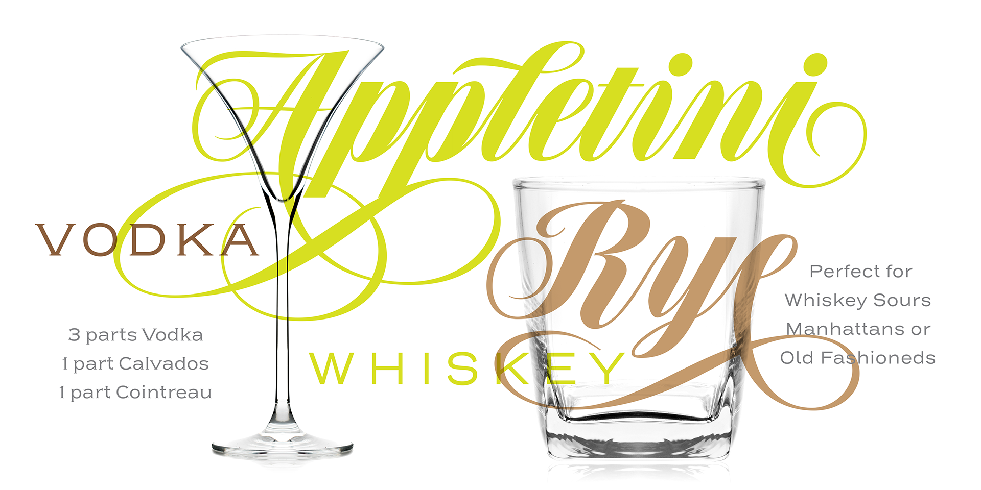
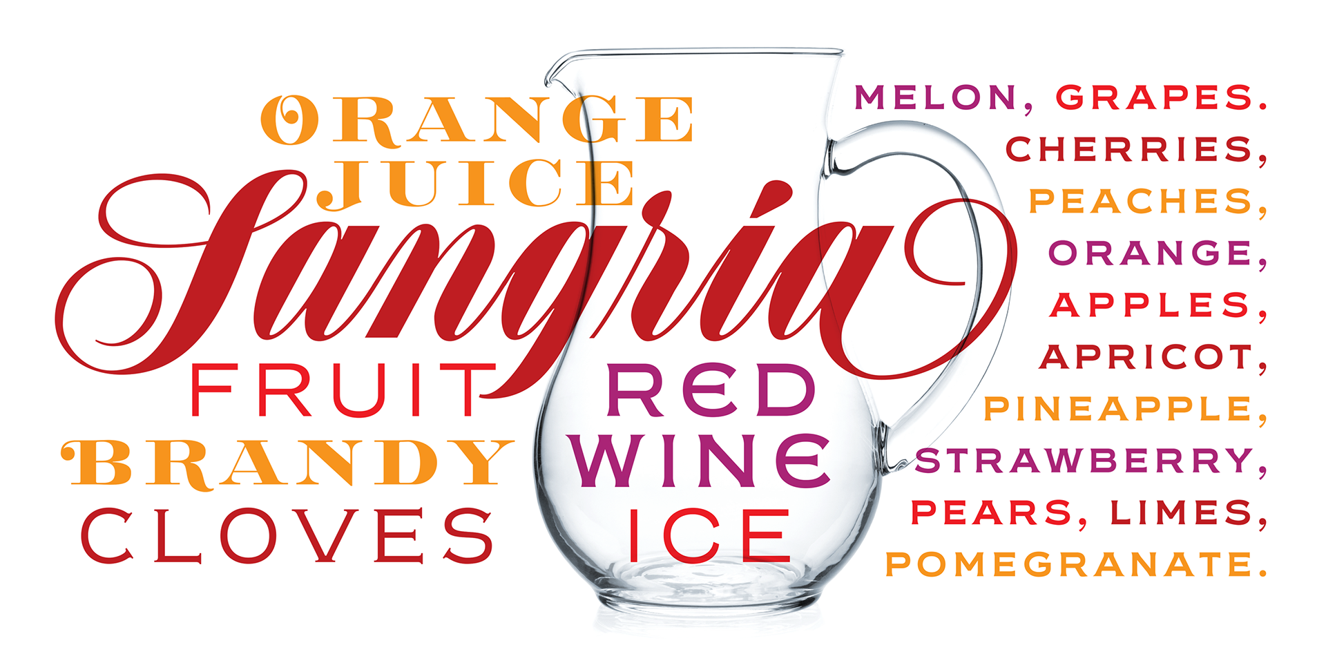
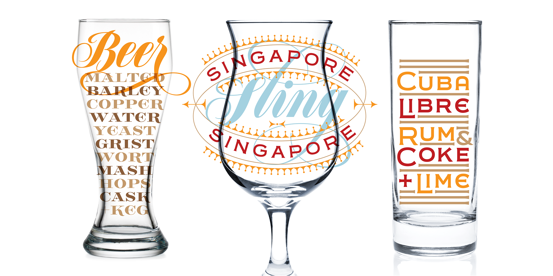
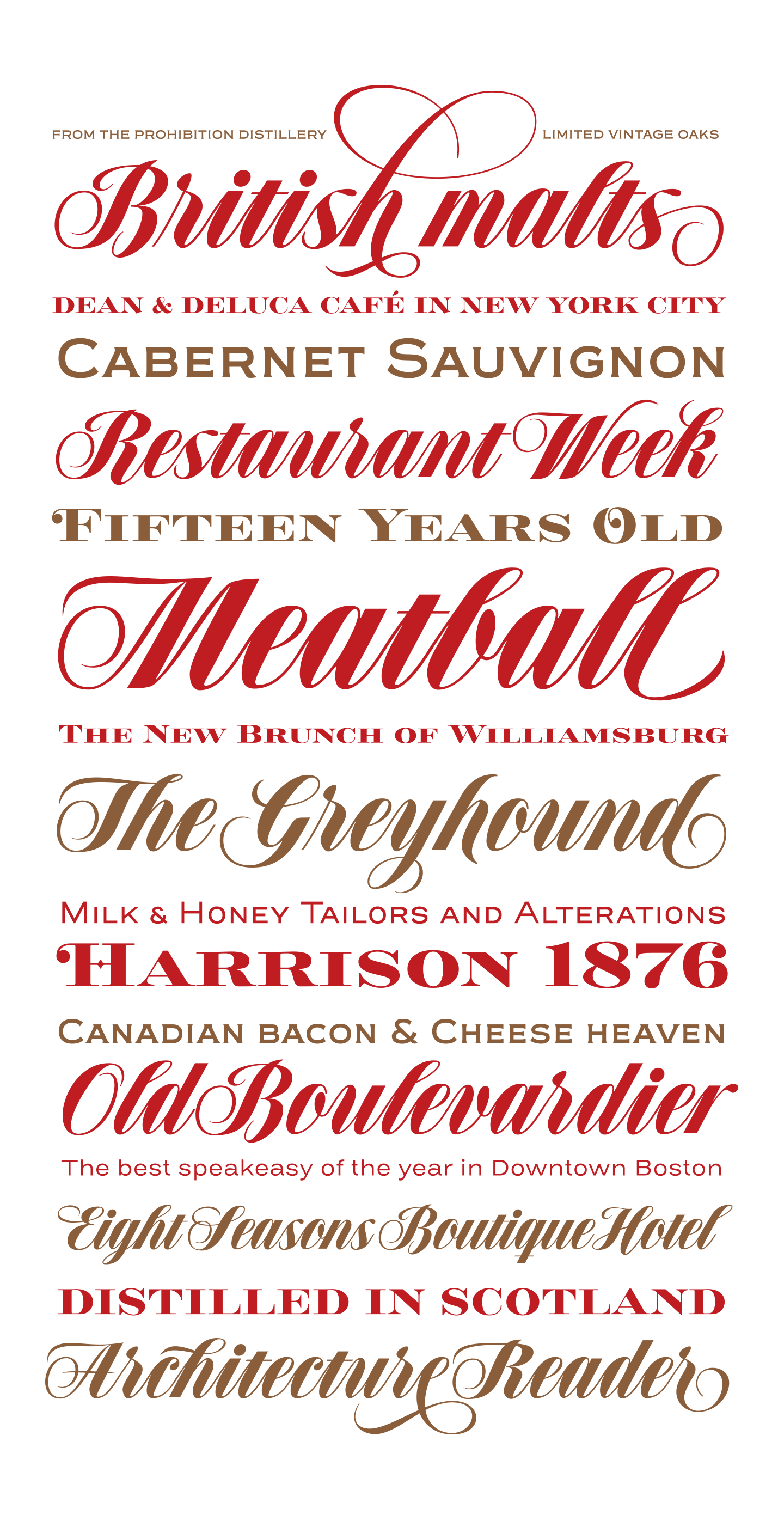
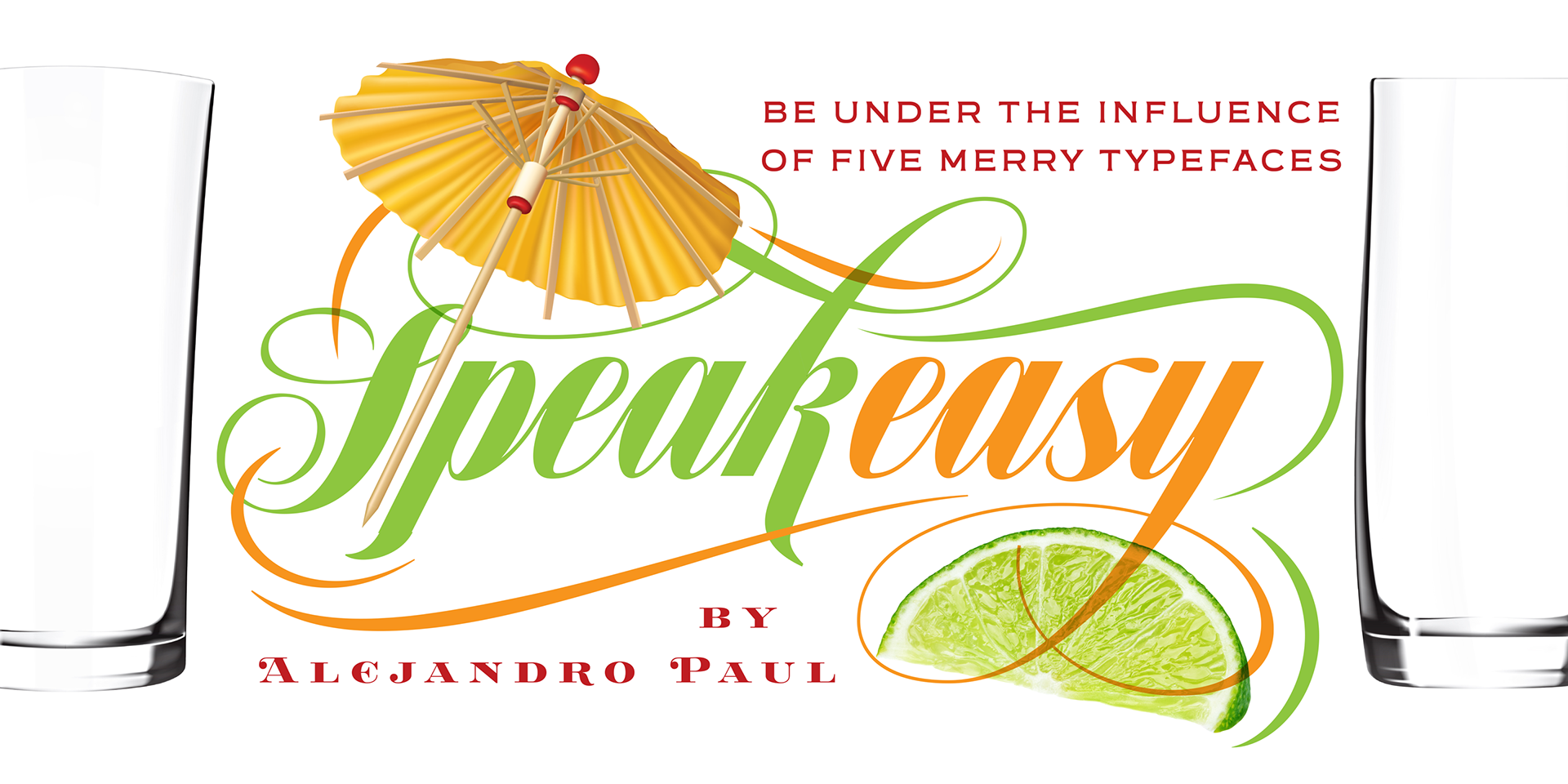
Speakeasy is a 5-font combo thematically built as a toolset for designing menus and liquor labels but also for coffees, restaurants and signs that communicate with style. Originally put together to be used by the most famous speakeasy in Buenos Aires, this set contains a script, a minor (almost flat) wedge serif, a flare serif, a sans serif, and a bold Didone. The seed for the script was found in a German lettering book, and the other fonts reflect the familiar advertising and announcement styles of the early 20th century.
The Speakeasy script is a connected one, but comes with two different ways to connect the letterforms. It also comes with many alternates, swashes, endings and flourishes — all accessible via OpenType features or glyph palettes.
Speakeasy Modern and Speakeasy Flare are small cap fonts, and come with a few alternates. Speakeasy Sans and Speakeasy Gothic come with full sets of majuscules and minuscules, but contain small caps and a few alternates as well. A few rules and ornaments are also sprinkled throughout the set.
This combination of fonts worked wonderfully for the project that called for it. Hopefully it will work just as well for your project.