About the project.
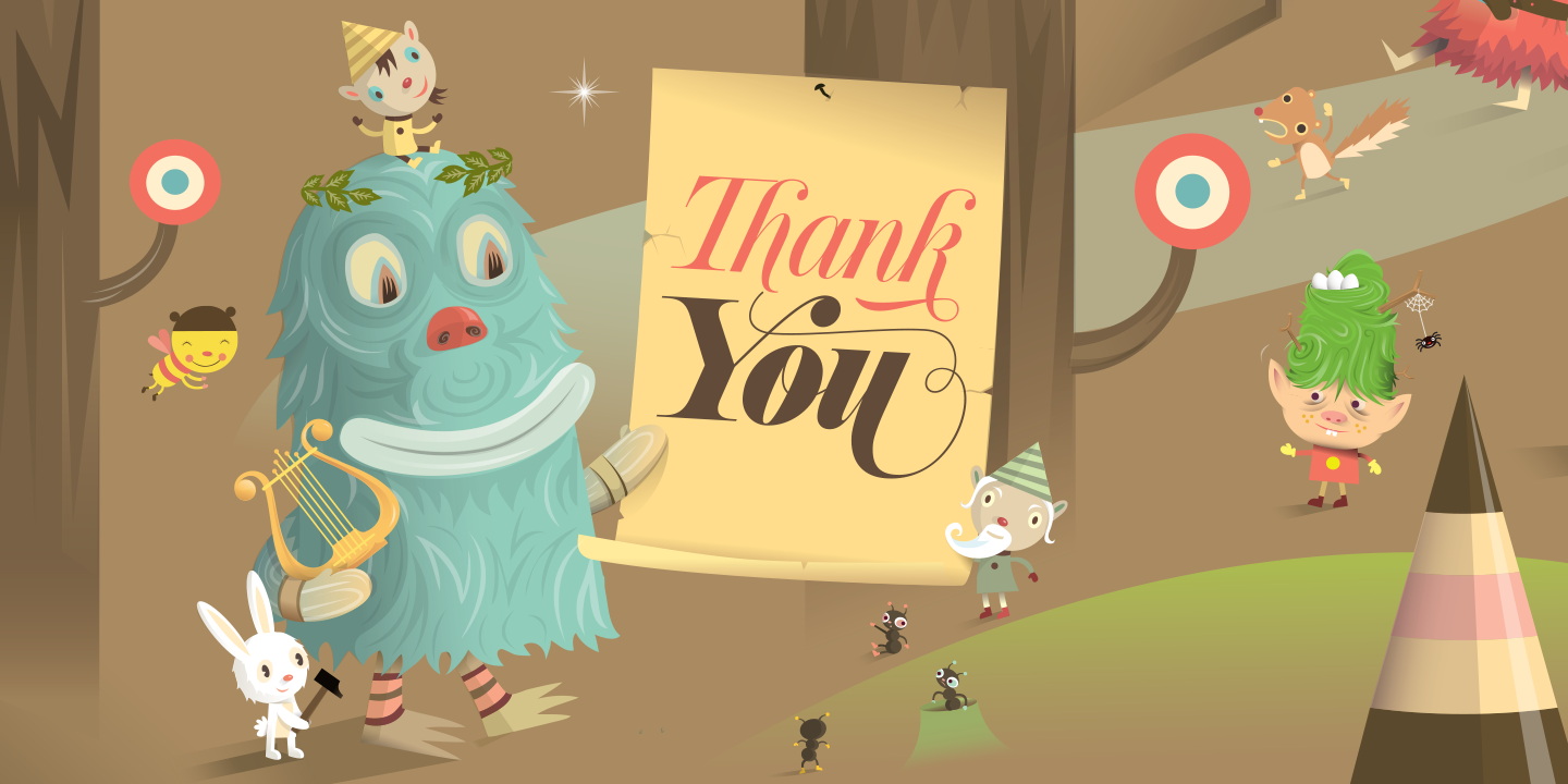
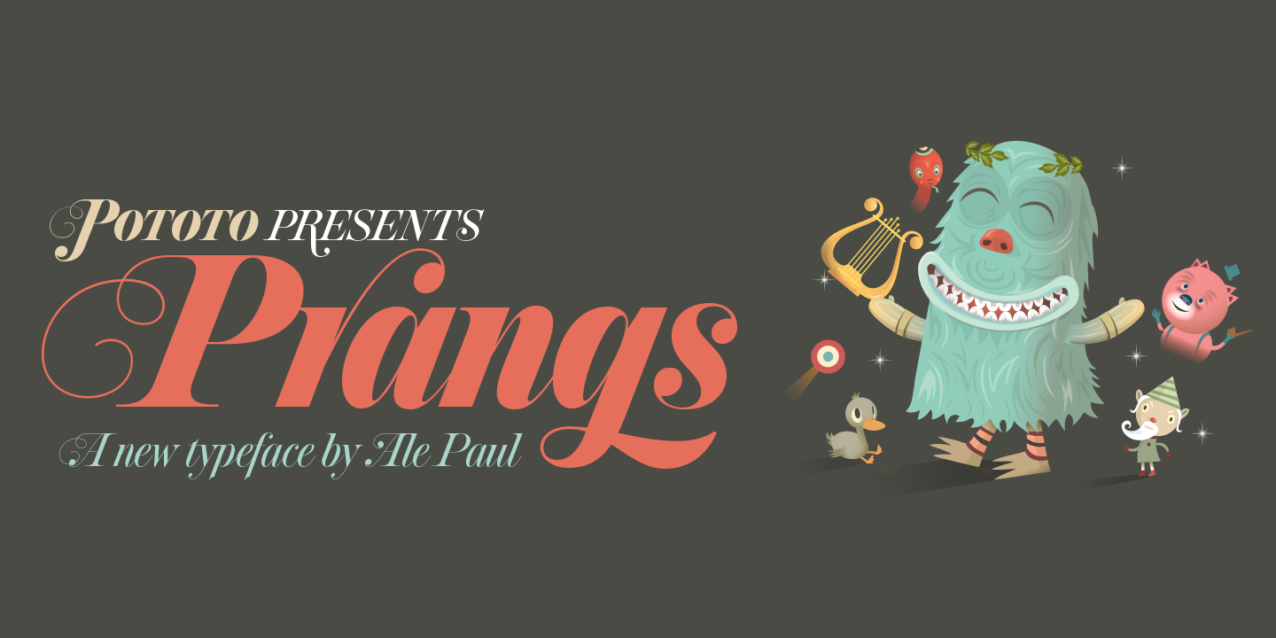
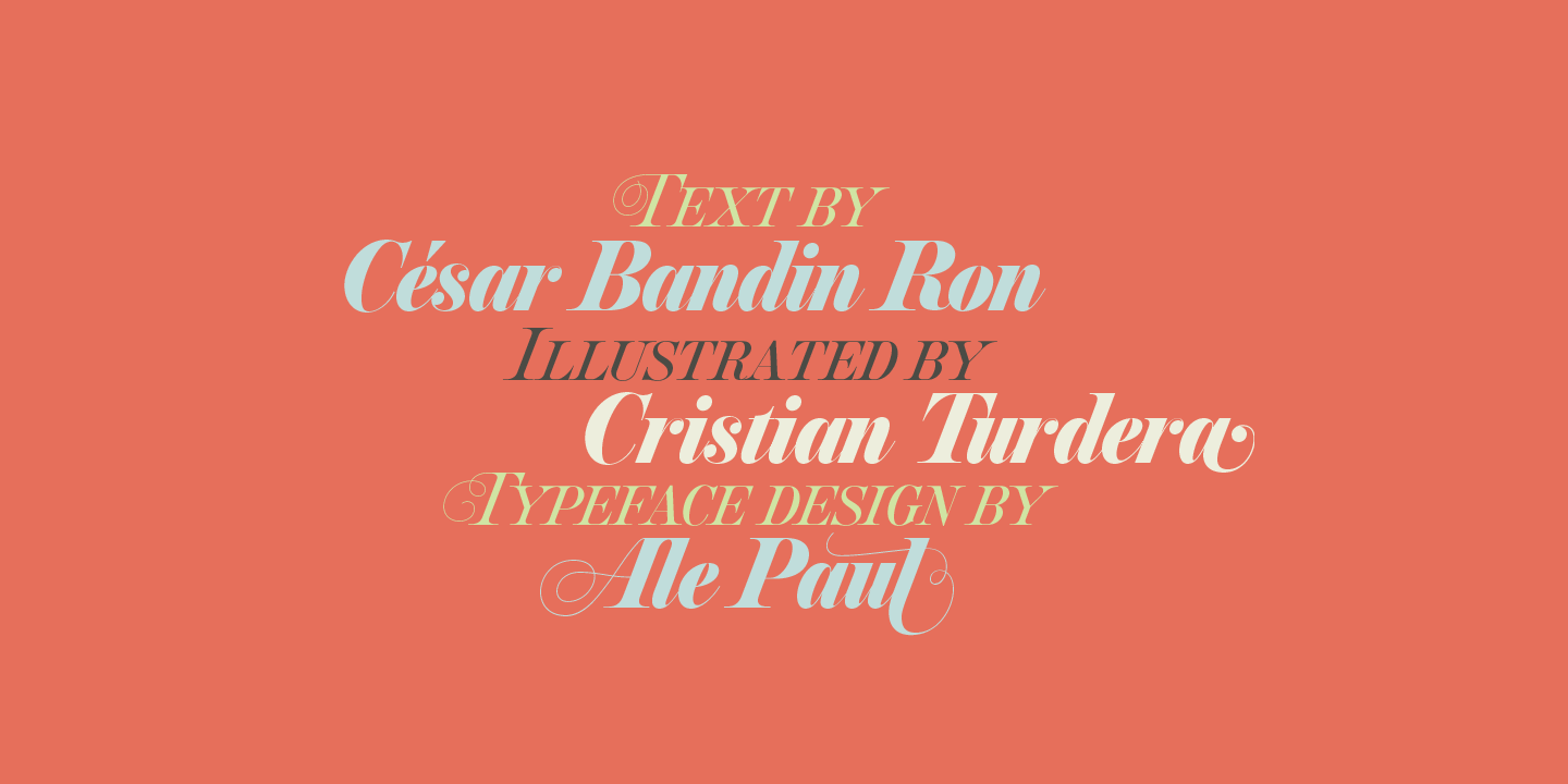
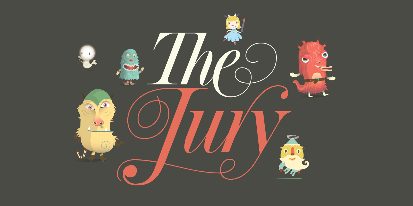
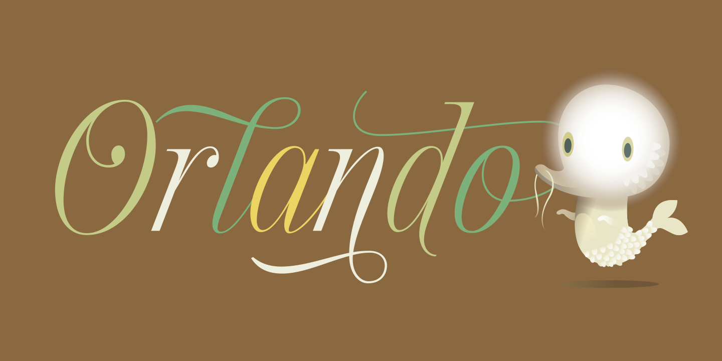
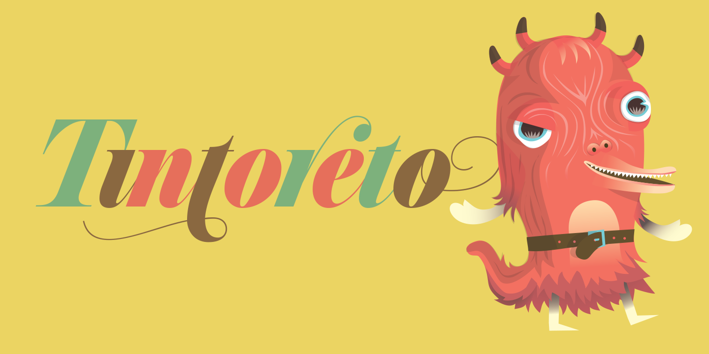
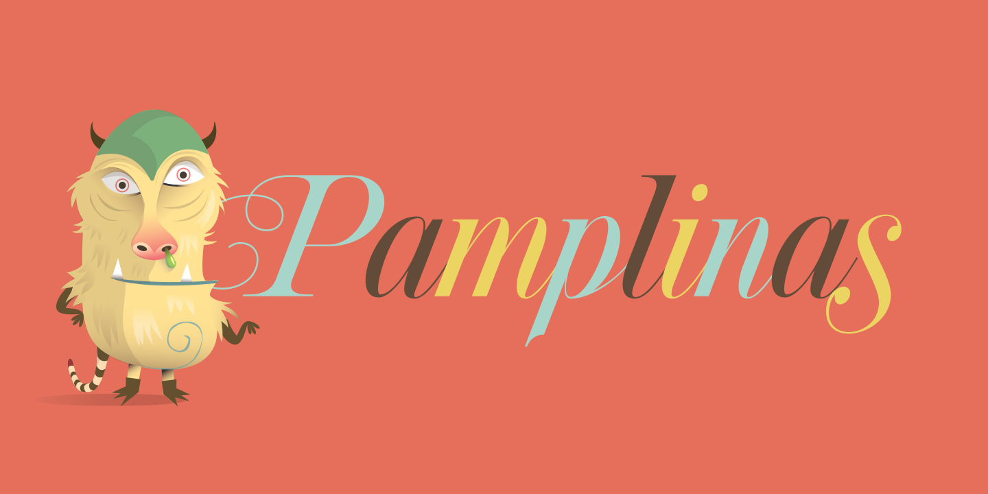
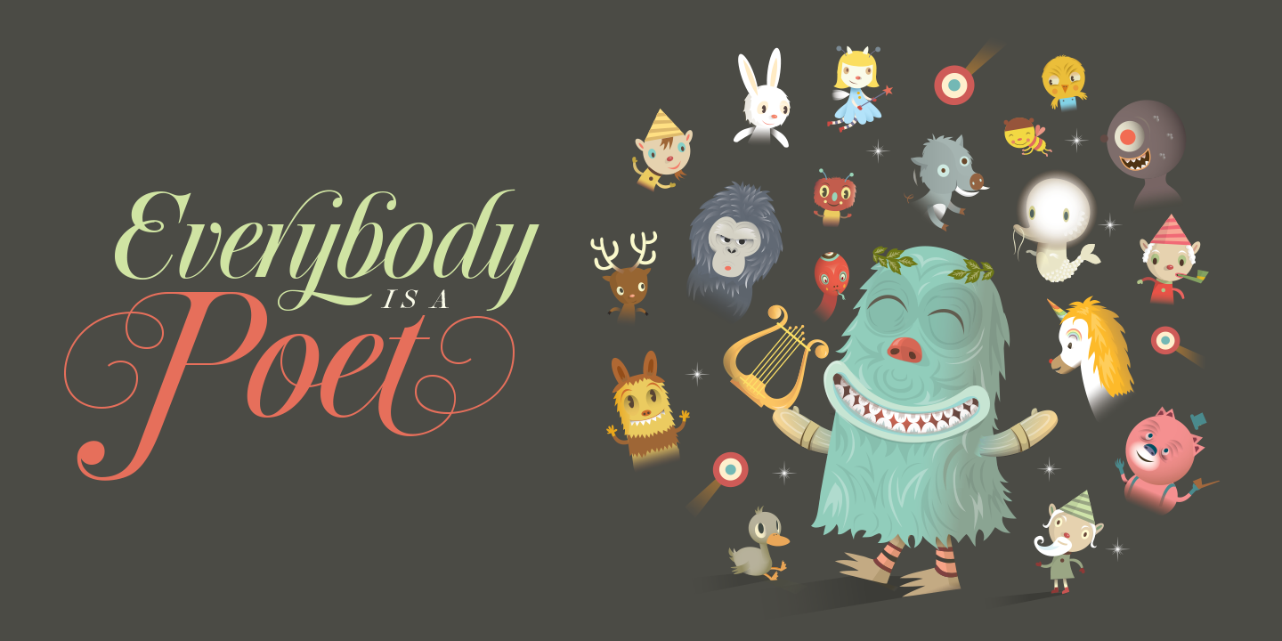
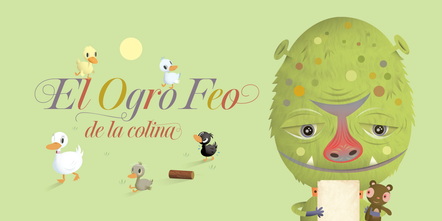
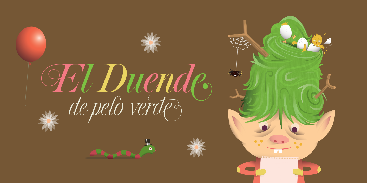
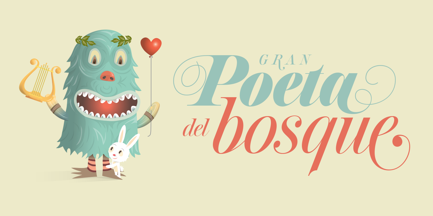
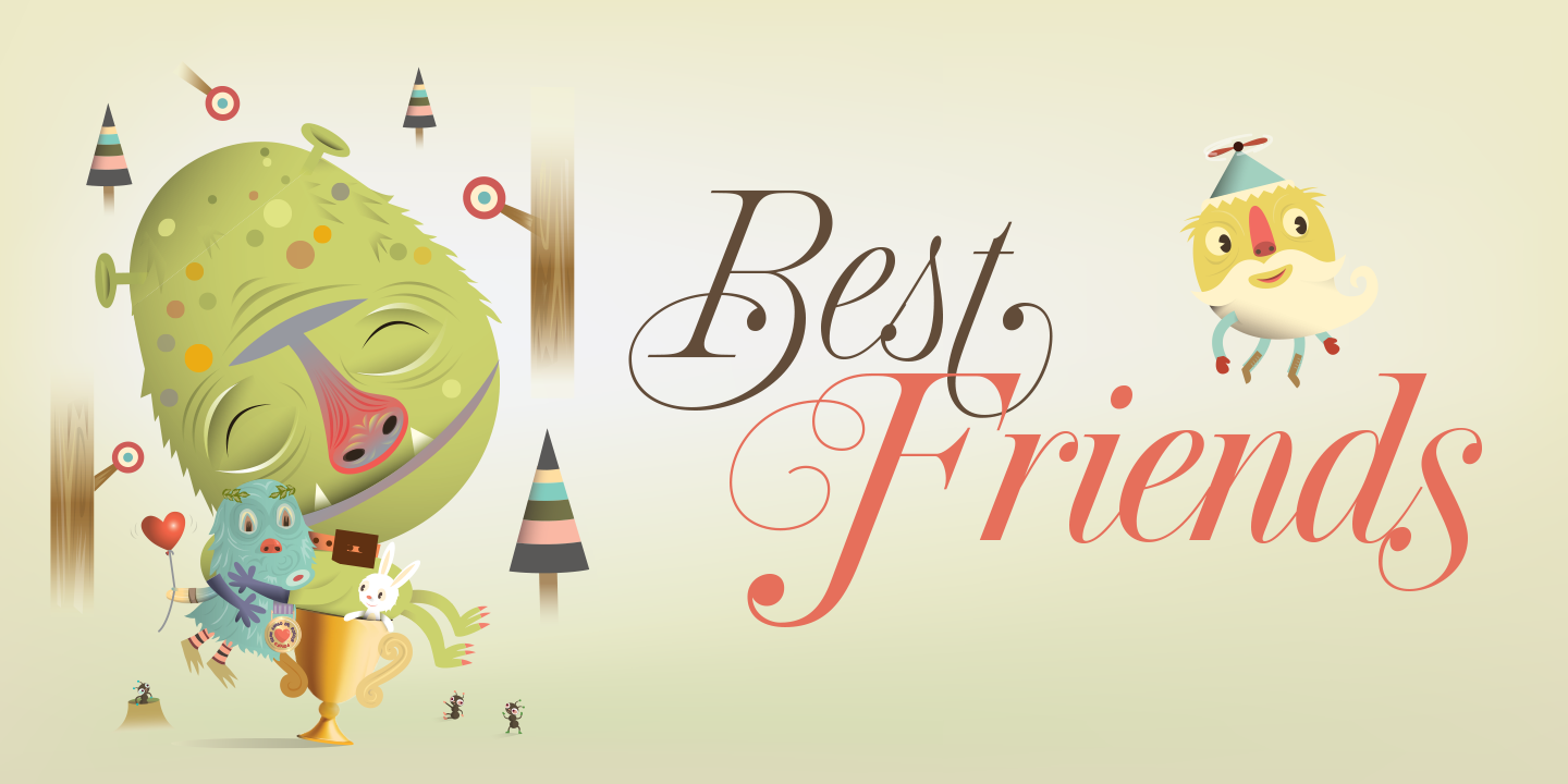
In late 2015 I was working on a new typeface called Prangs, that I envisioned would work well for fashion and beauty applications, when the talented Argentinian illustrator Cristian Turdera contacted me to collaborate with him on a typeface for his childrens’ book “Pototo.” I was pleasantly surprised to find that Prangs worked beautfifully in this very different context! — so I was happy to give it to Cristian for use in his book. Now he has repaid the favour by letting me use his beautiful illustrations for my type specimens.
In late 2015 I was working on a new typeface called Prangs, that I envisioned would work well for fashion and beauty applications, when the talented Argentinian illustrator Cristian Turdera contacted me to collaborate with him on a typeface for his childrens’ book “Pototo.” I was pleasantly surprised to find that Prangs worked beautfifully in this very different context! — so I was happy to give it to Cristian for use in his book. Now he has repaid the favour by letting me use his beautiful illustrations for my type specimens.
Get the Prangs typeface here.


About the typeface.
The late-19th-century Prussian-American printer and publisher Louis Prang, the “father of the American Christmas card”, was well-known for his efforts to improve art education in the United States. He published many instructional books and even founded a training school for art teachers. One of the books he published included a series of alphabets for sign painters, lithographers, illuminators, architects and civil engineers. There was nothing truly original there — in the book’s preface, Prang says that the alphabets were “based on foreign forms and adapted for American taste”.
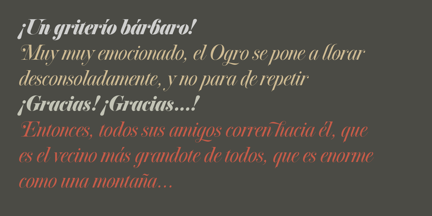
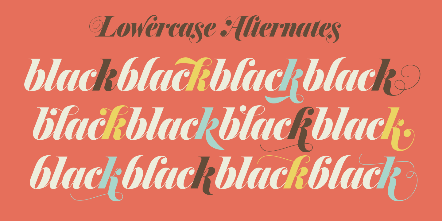
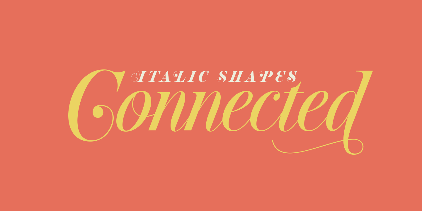
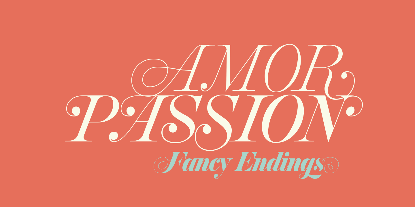
The one alphabet that caught my attention in that book was one simply called “Italic”. It’s a hig- contrast modern, a Didone really, but with an interesting little twist: the lowercase is almost entirely connected, which makes for an interesting mix of modern typography and classic calligraphy. That stuff is right up my alley now. Whenever my eyes happen on a modern, it’s easy, even almost impulsive for me to envision swashes coming out of serifs and terminals. The caps melt and the minuscules dance with them.
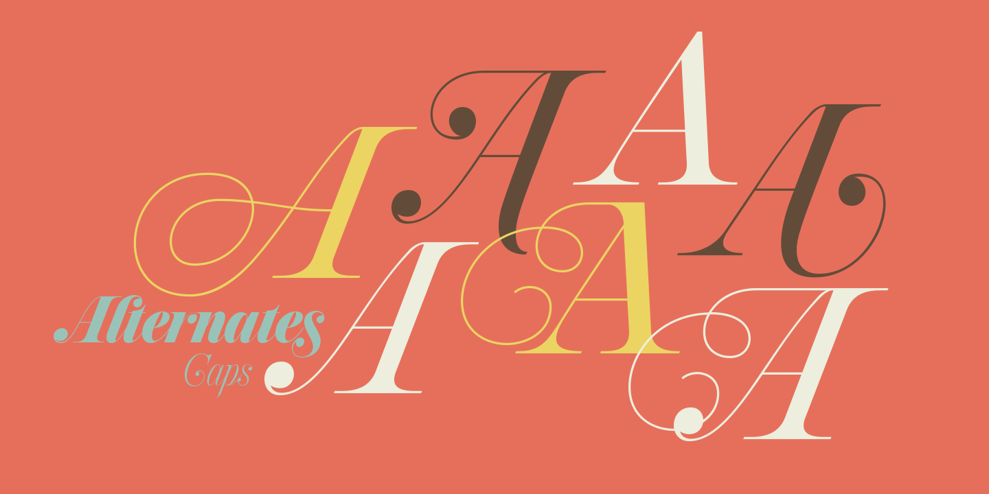
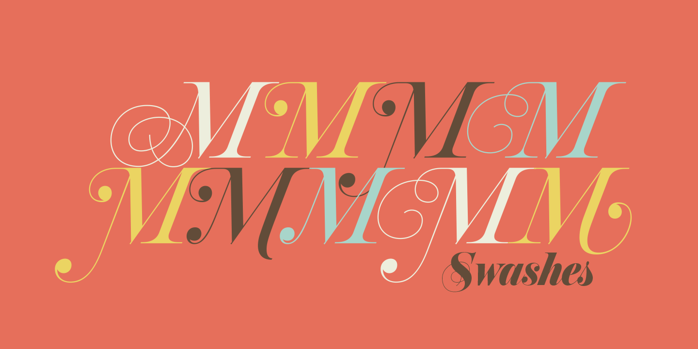
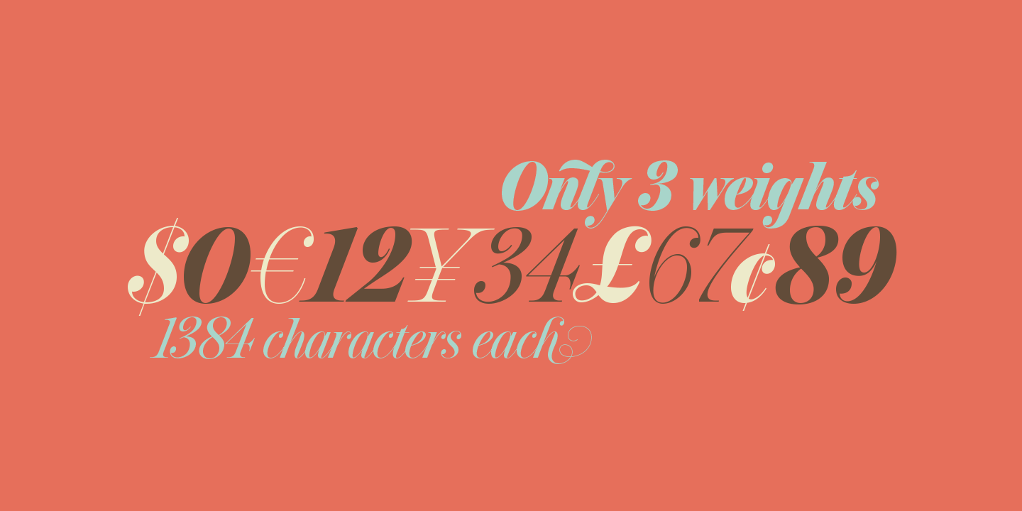
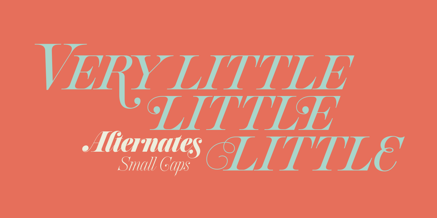
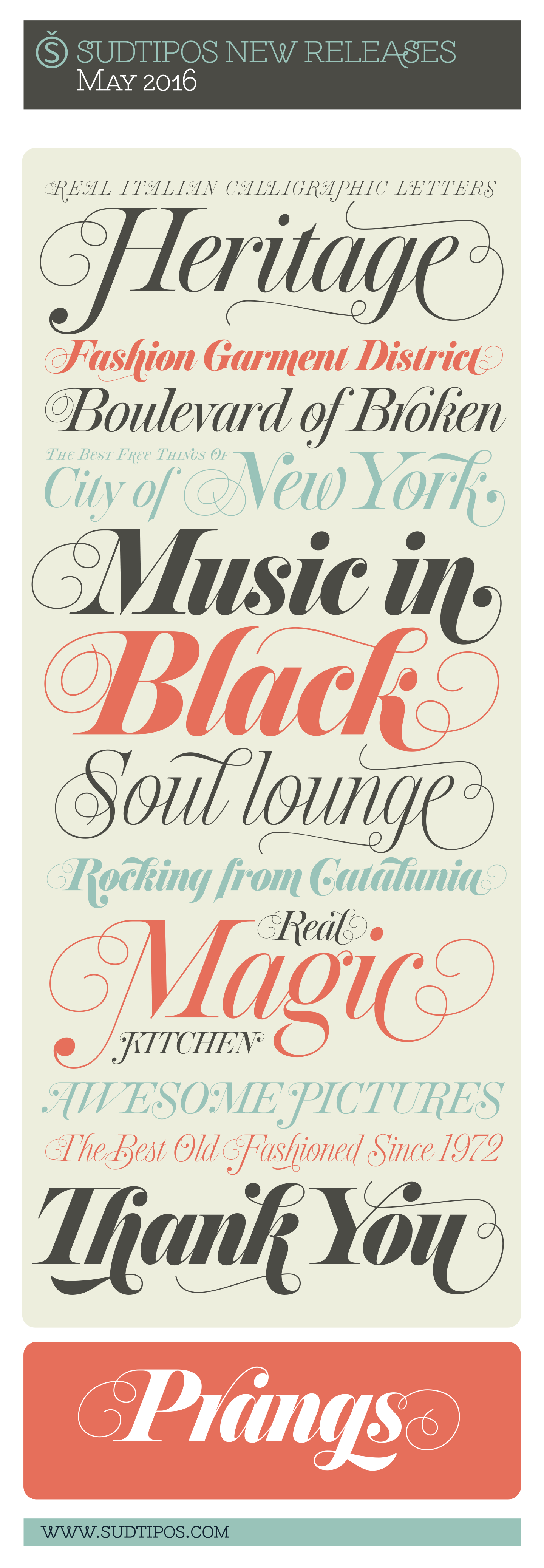
And so I brought my vision to life. Prangs is an italic set of three weights, each containing more than 1300 glyphs with plenty of OpenType features and Latin language support. This set celebrates the convergence of three centuries of fancy display alphabets. These fonts should work wherever moderns are used to elevate and scripts are used to appeal — namely today’s branding, packaging and glossy publications.
The one alphabet that caught my attention in that book was one simply called “Italic”. It’s a hig- contrast modern, a Didone really, but with an interesting little twist: the lowercase is almost entirely connected, which makes for an interesting mix of modern typography and classic calligraphy. That stuff is right up my alley now. Whenever my eyes happen on a modern, it’s easy, even almost impulsive for me to envision swashes coming out of serifs and terminals. The caps melt and the minuscules dance with them.
And so I brought my vision to life. Prangs is an italic set of three weights, each containing more than 1300 glyphs with plenty of OpenType features and Latin language support. This set celebrates the convergence of three centuries of fancy display alphabets. These fonts should work wherever moderns are used to elevate and scripts are used to appeal — namely today’s branding, packaging and glossy publications.


For a limited time you we will offer a very special introductory discount here!
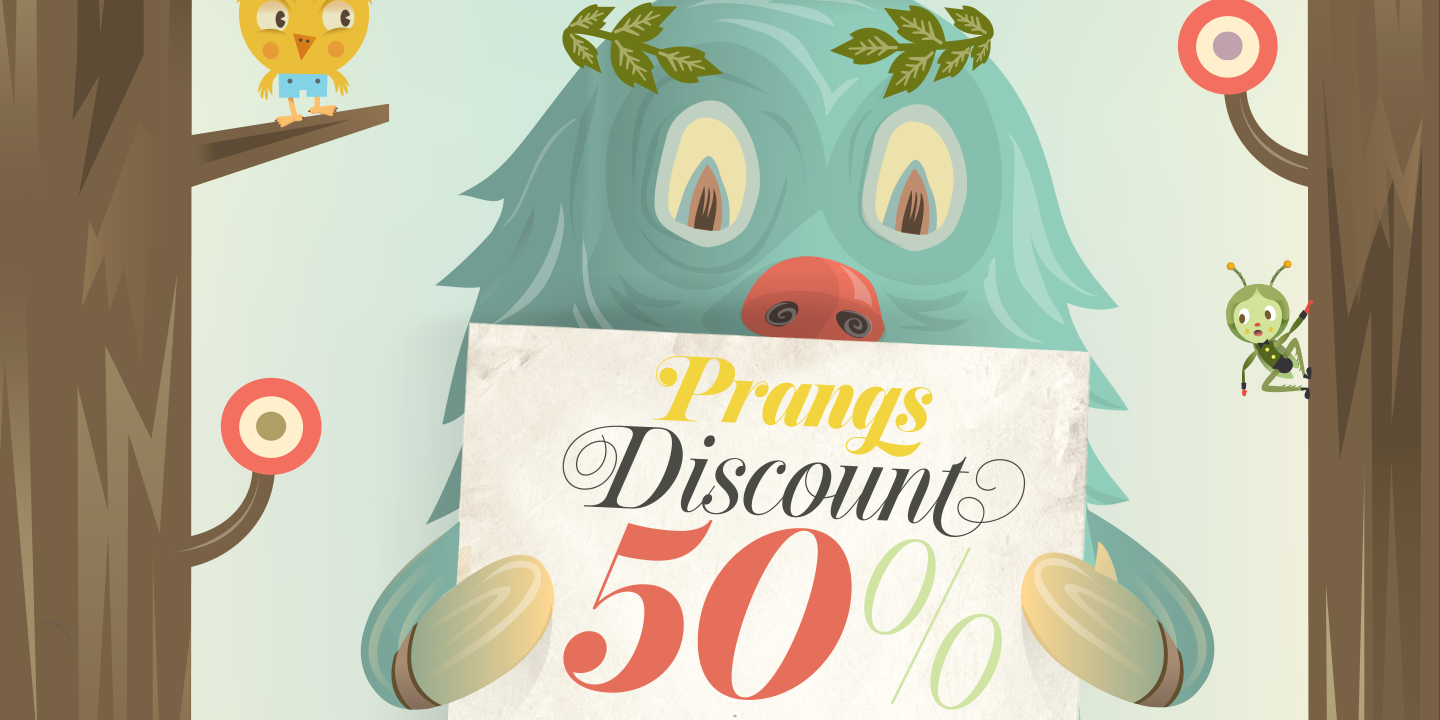

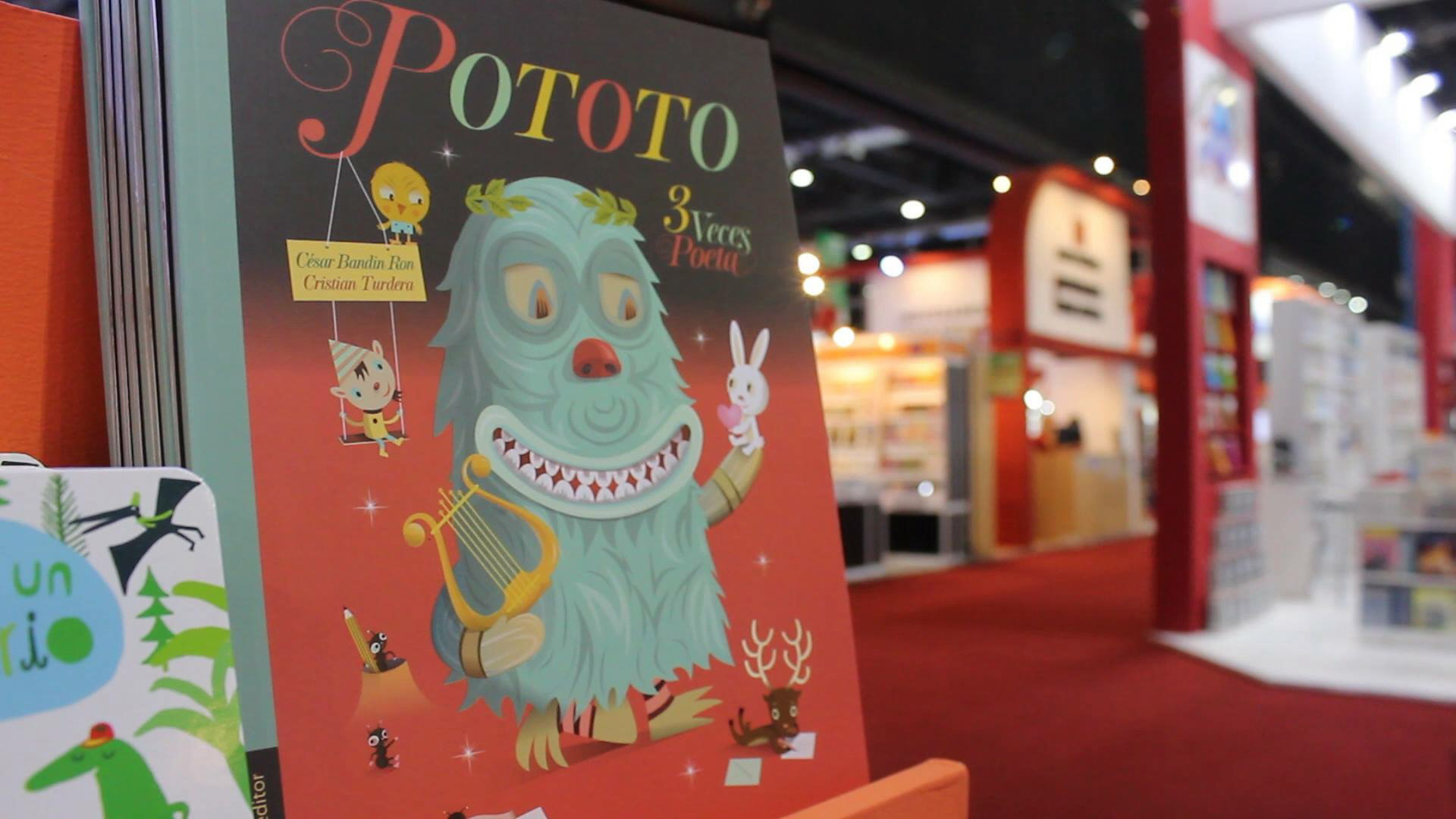
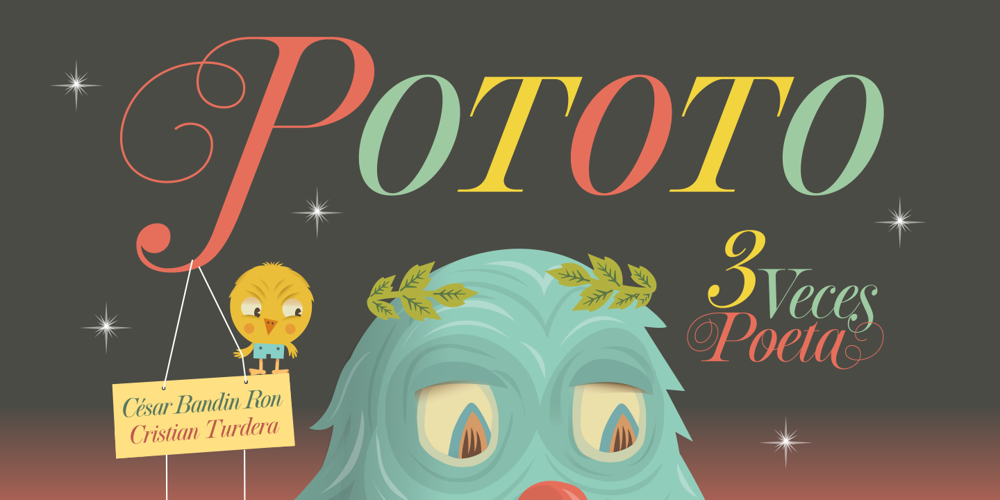
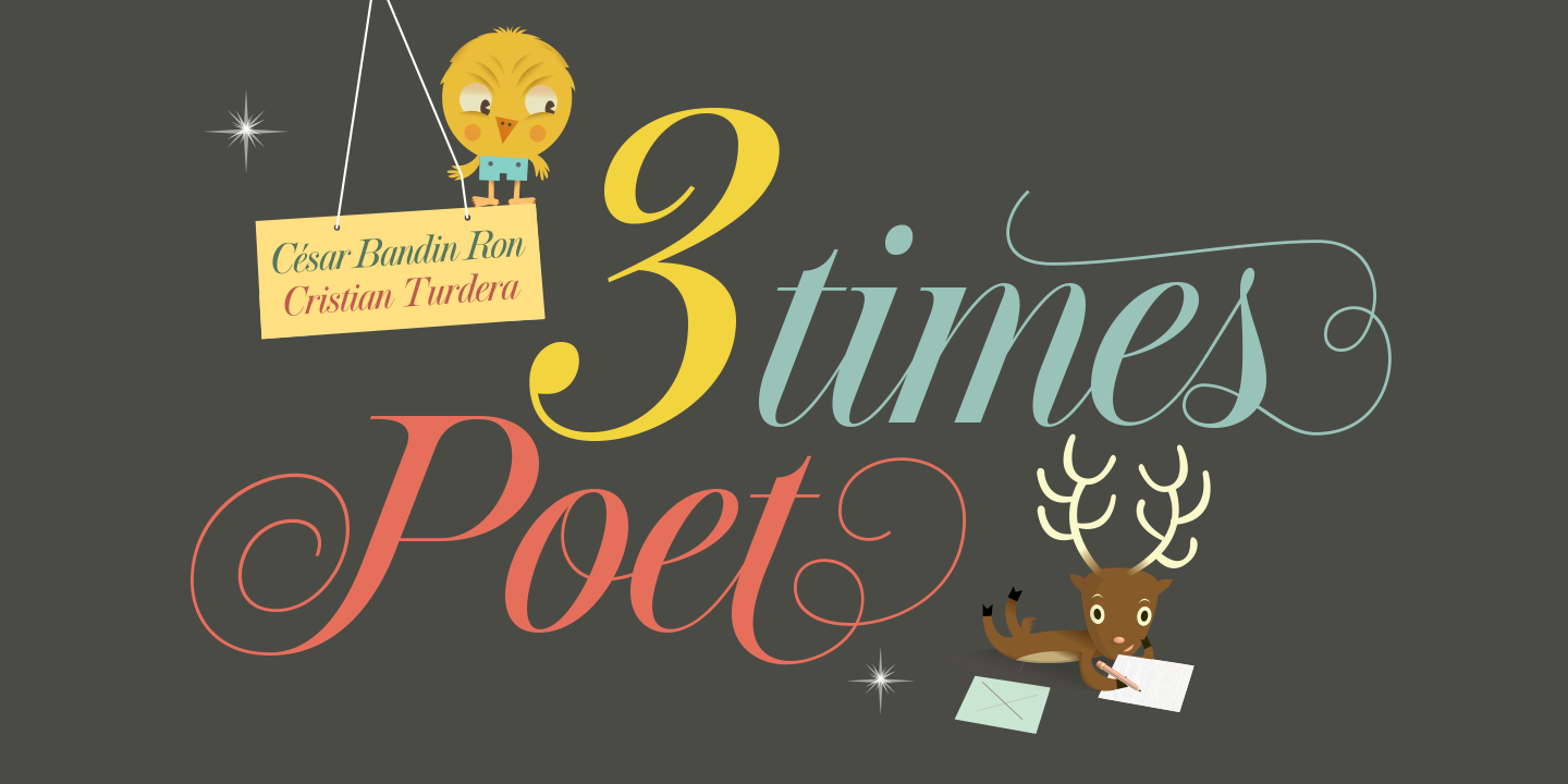
Pototo's book is available (in spanish) at Pequeño Editor. Check the Cristian Turdera's awesome portfolio here!