
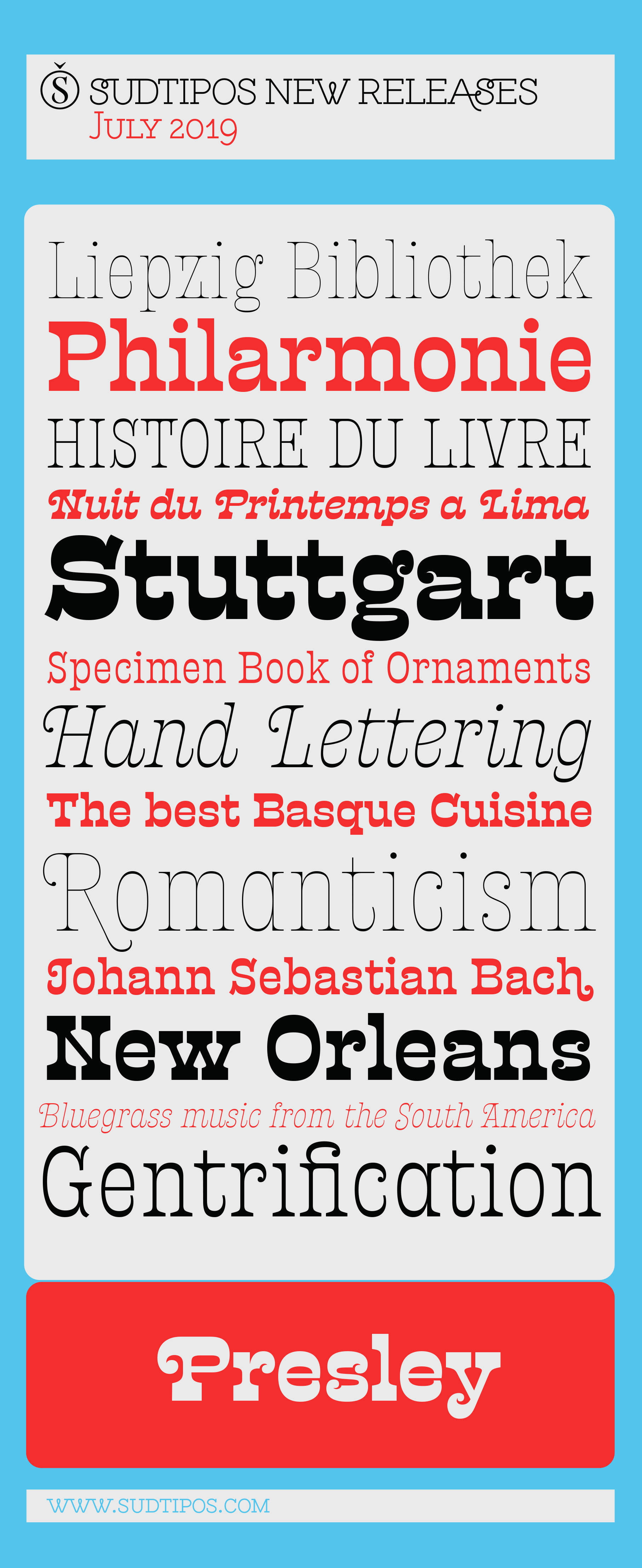
Presley Slab.
New Sudtipos' font family.
—
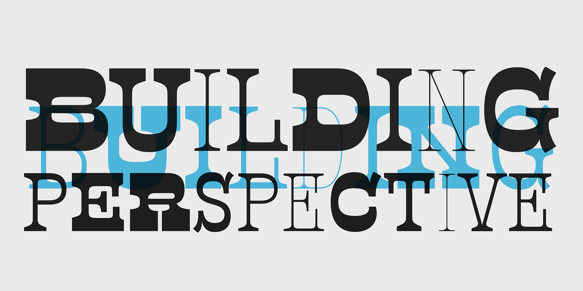
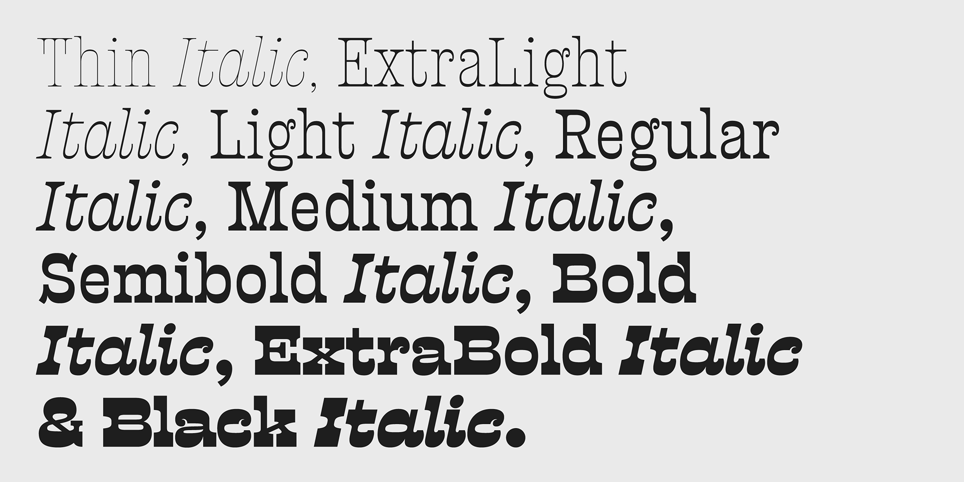
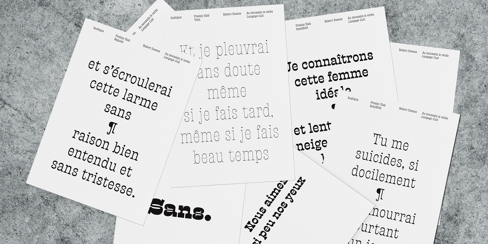
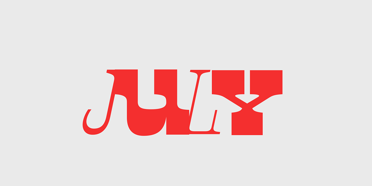
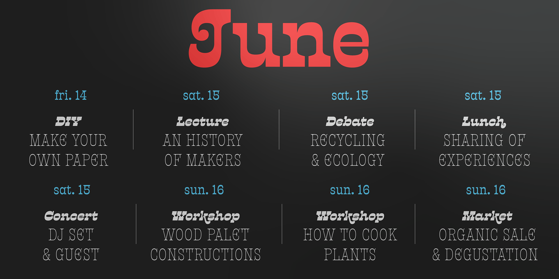
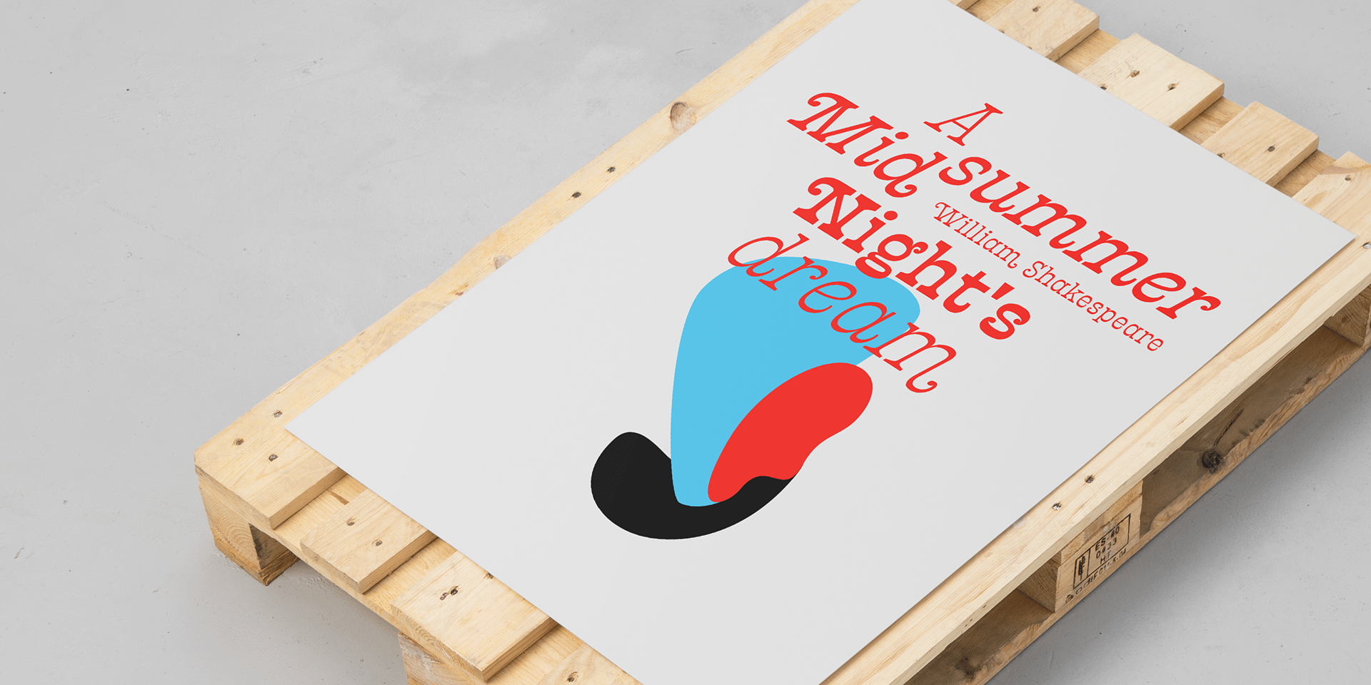
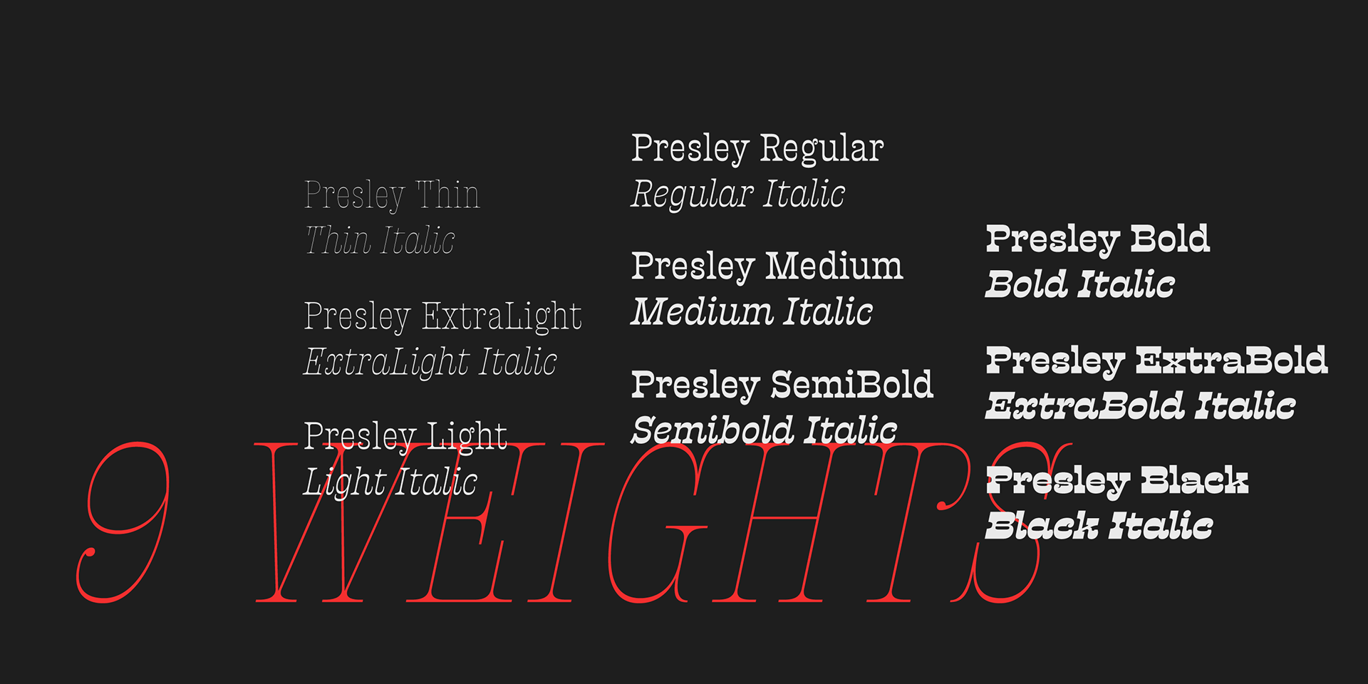
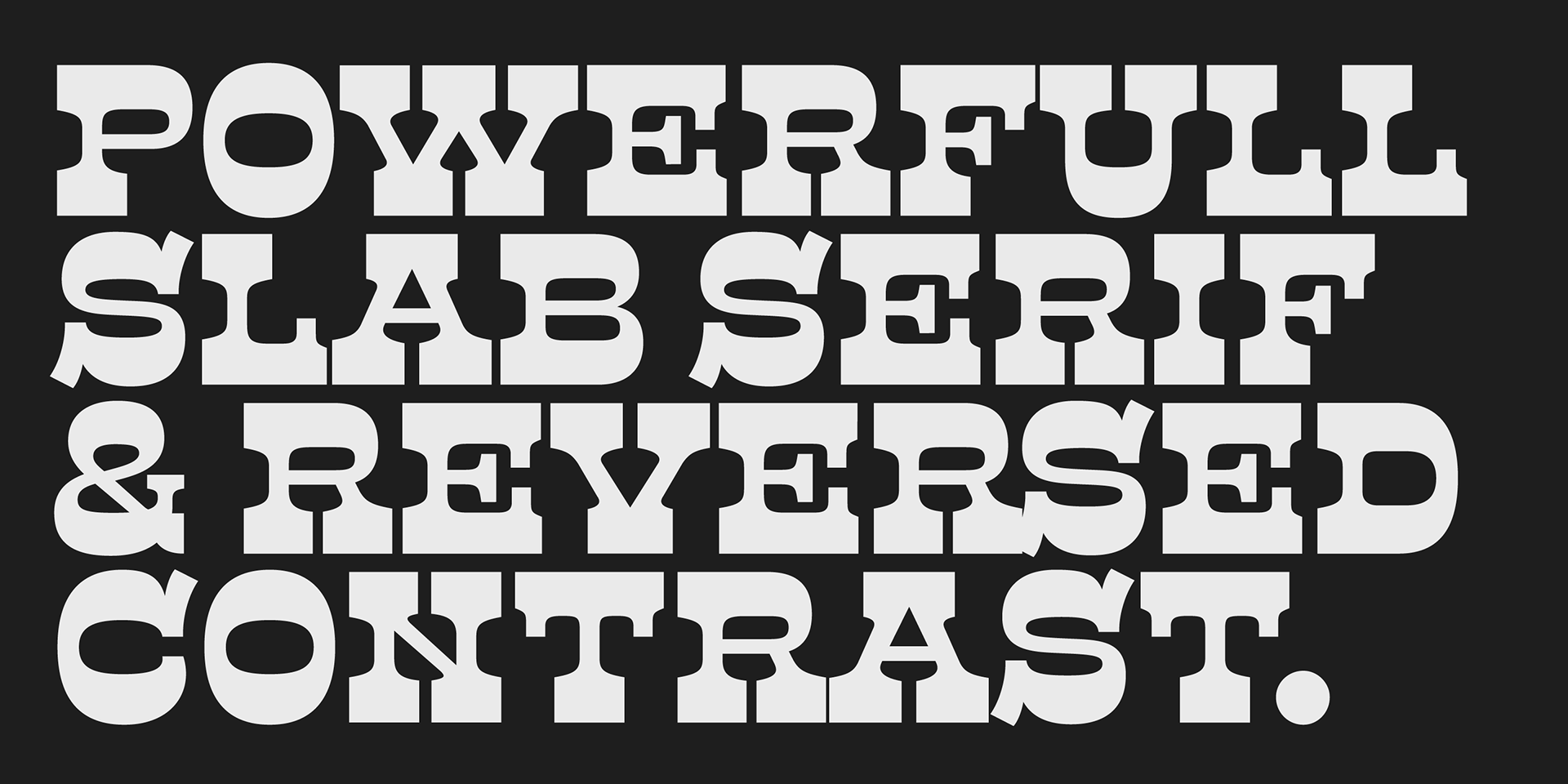
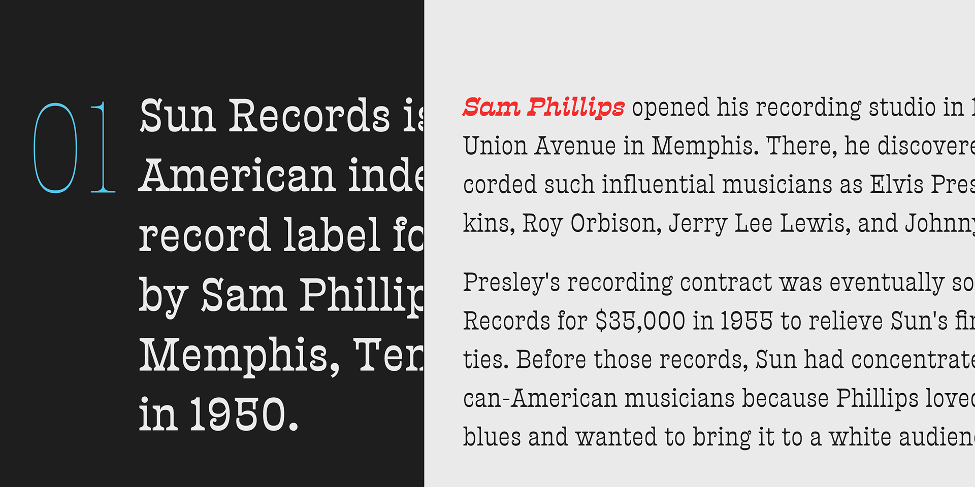
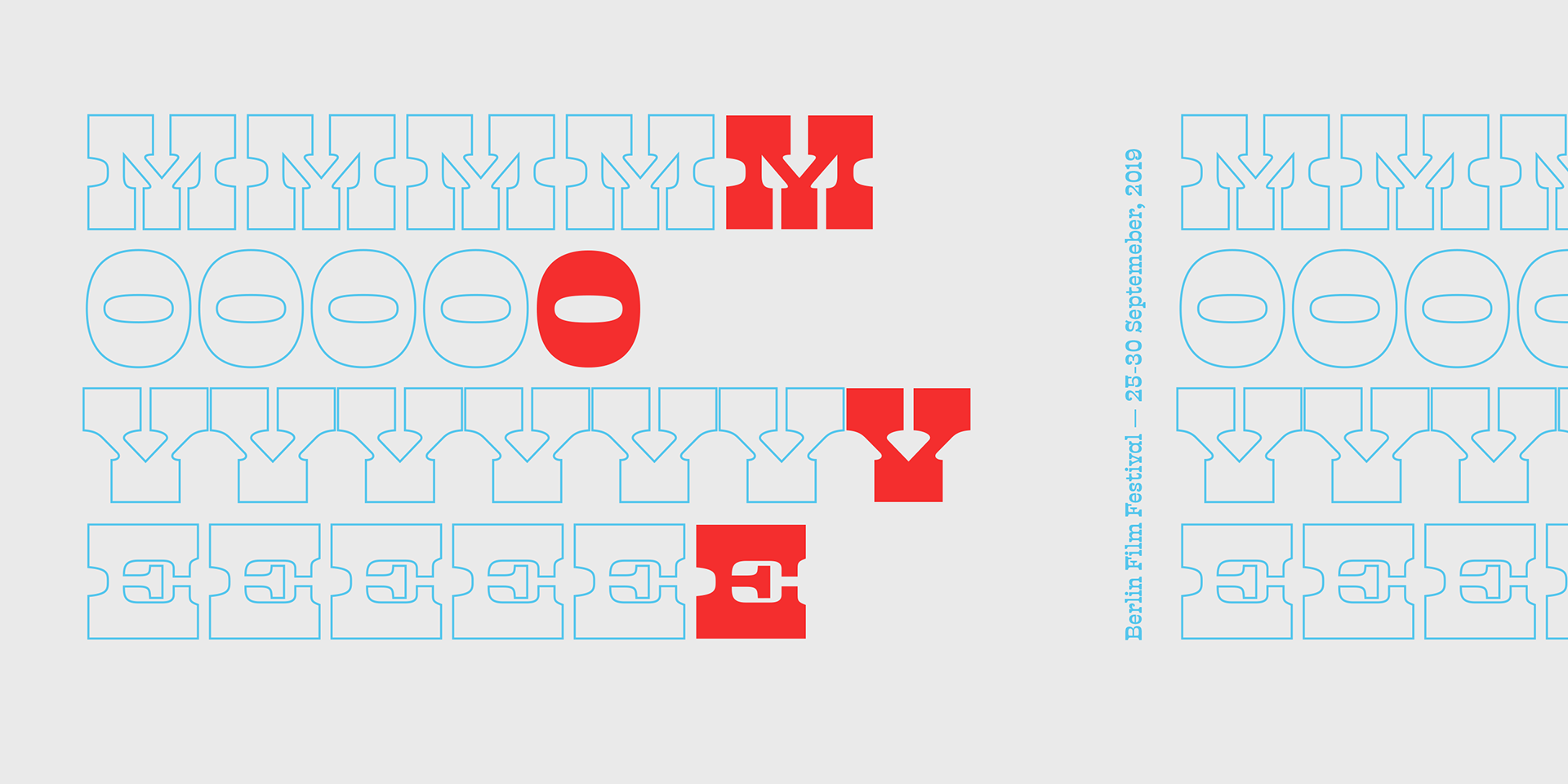
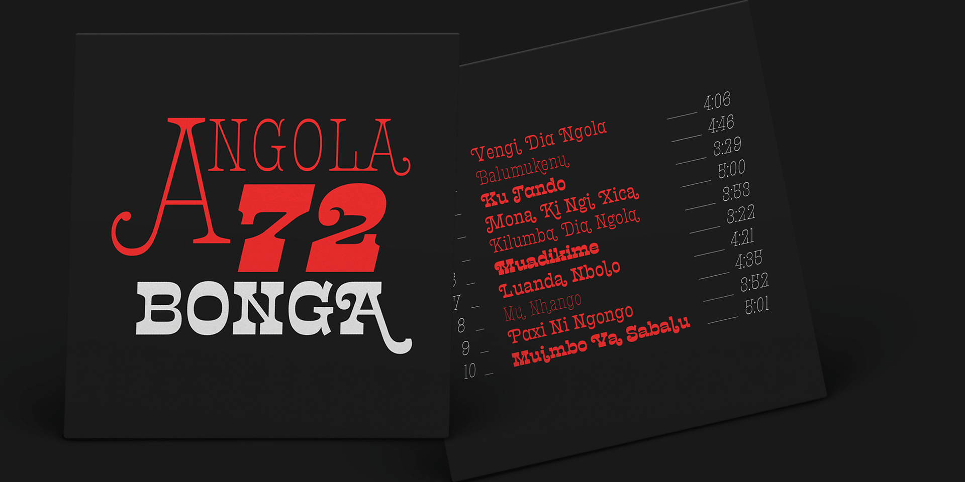
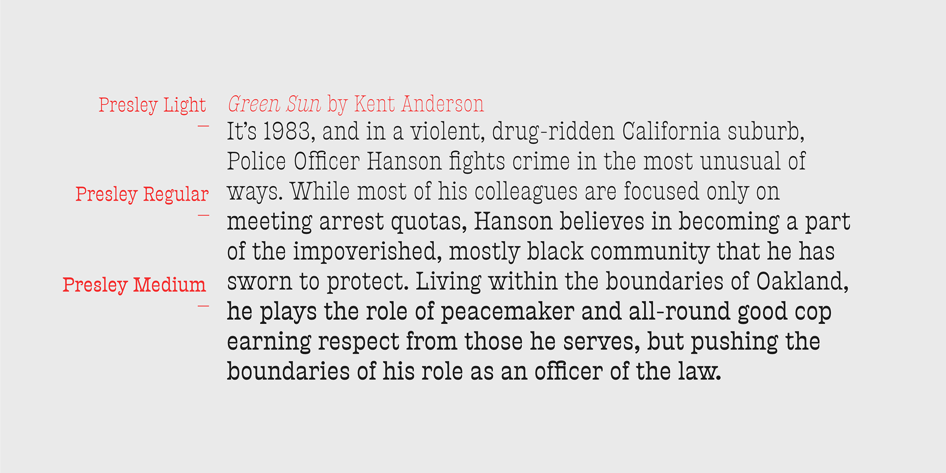
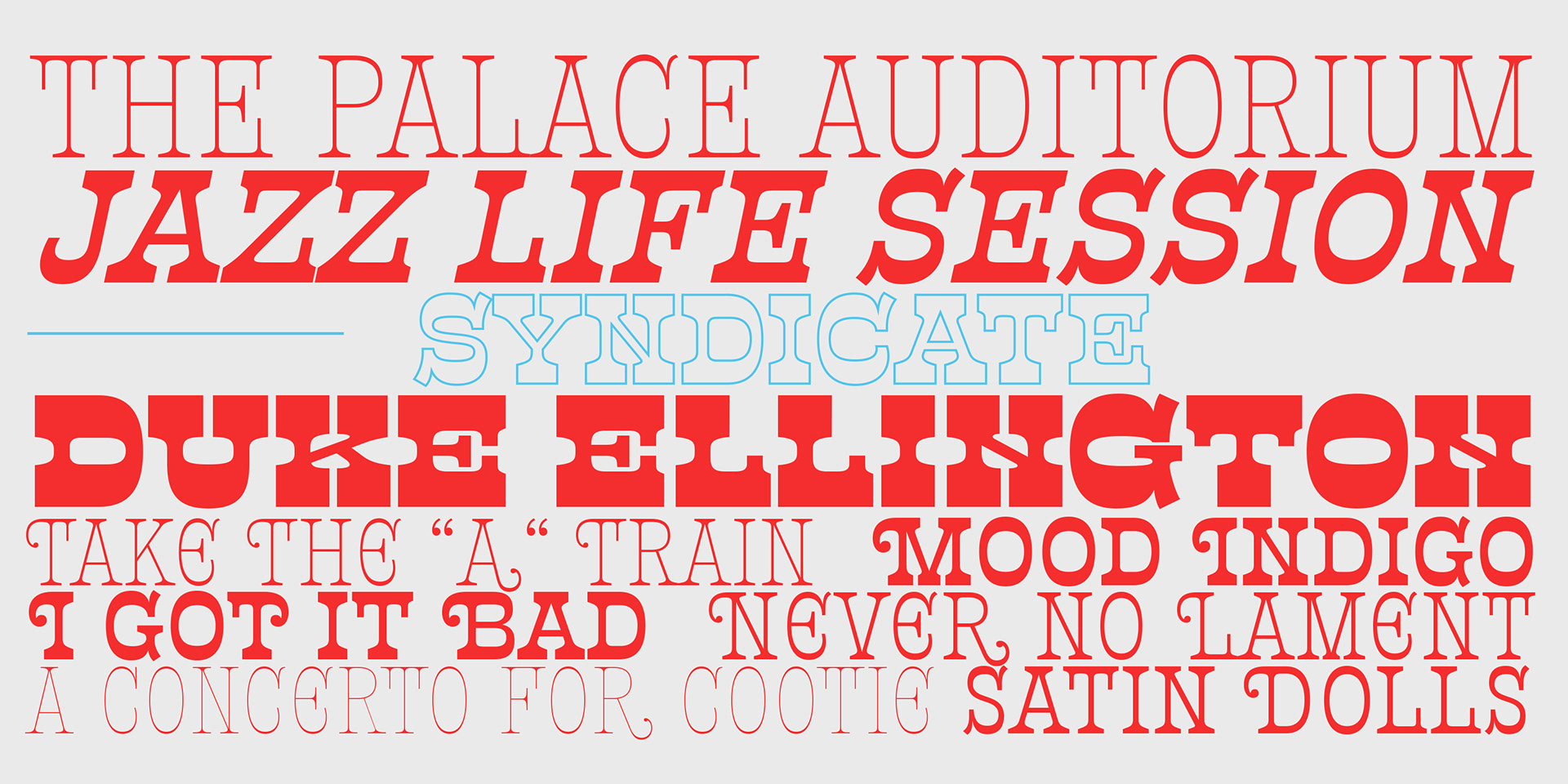
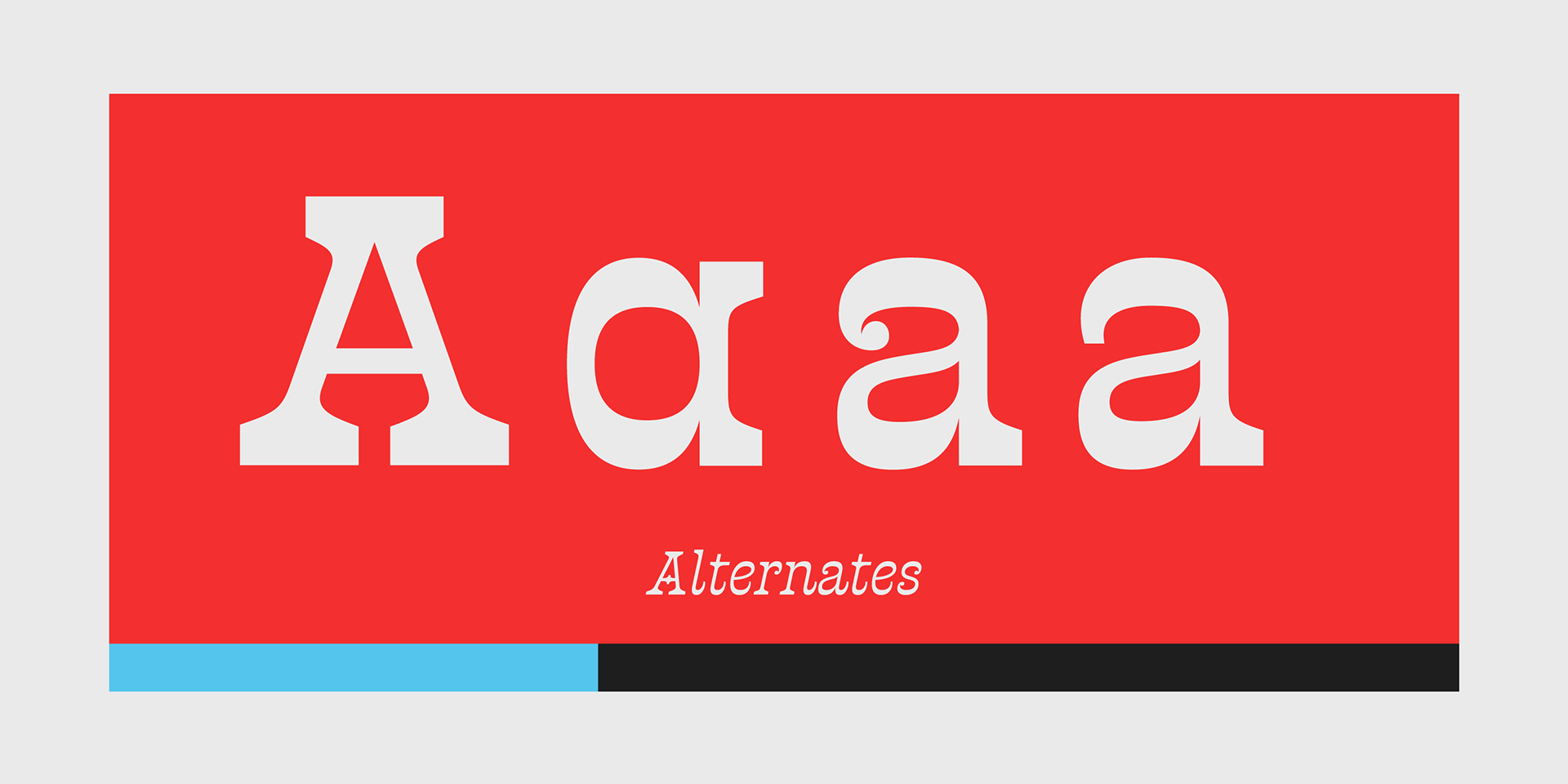
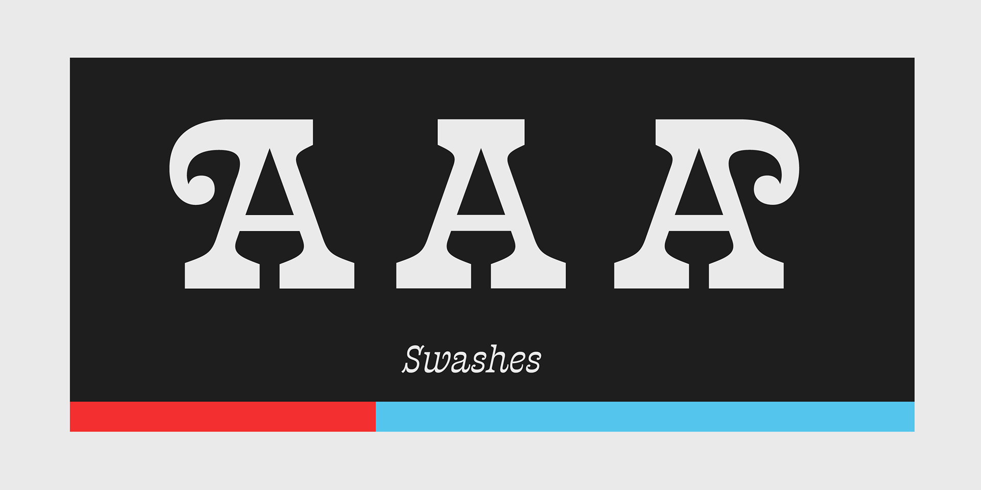
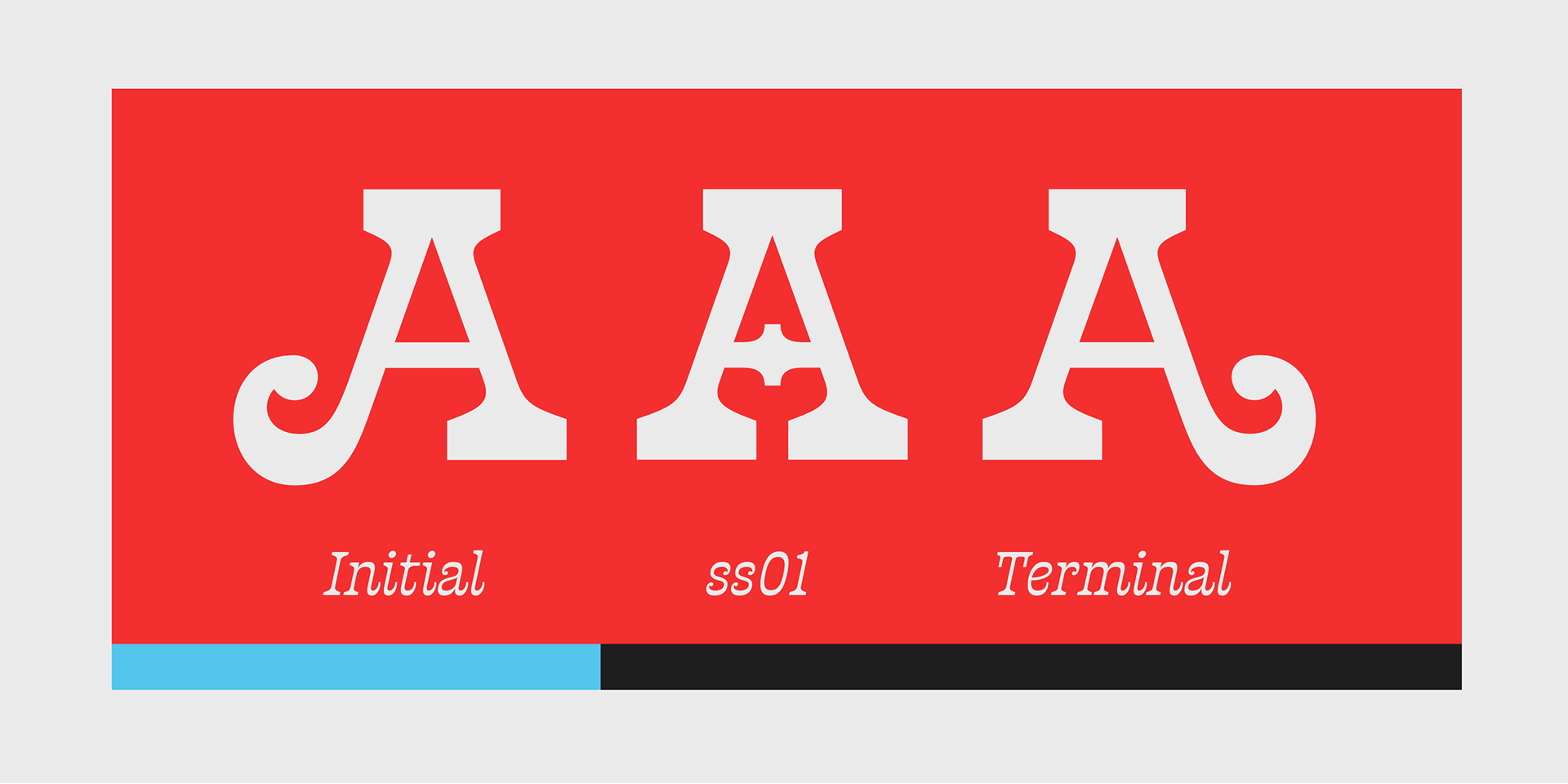
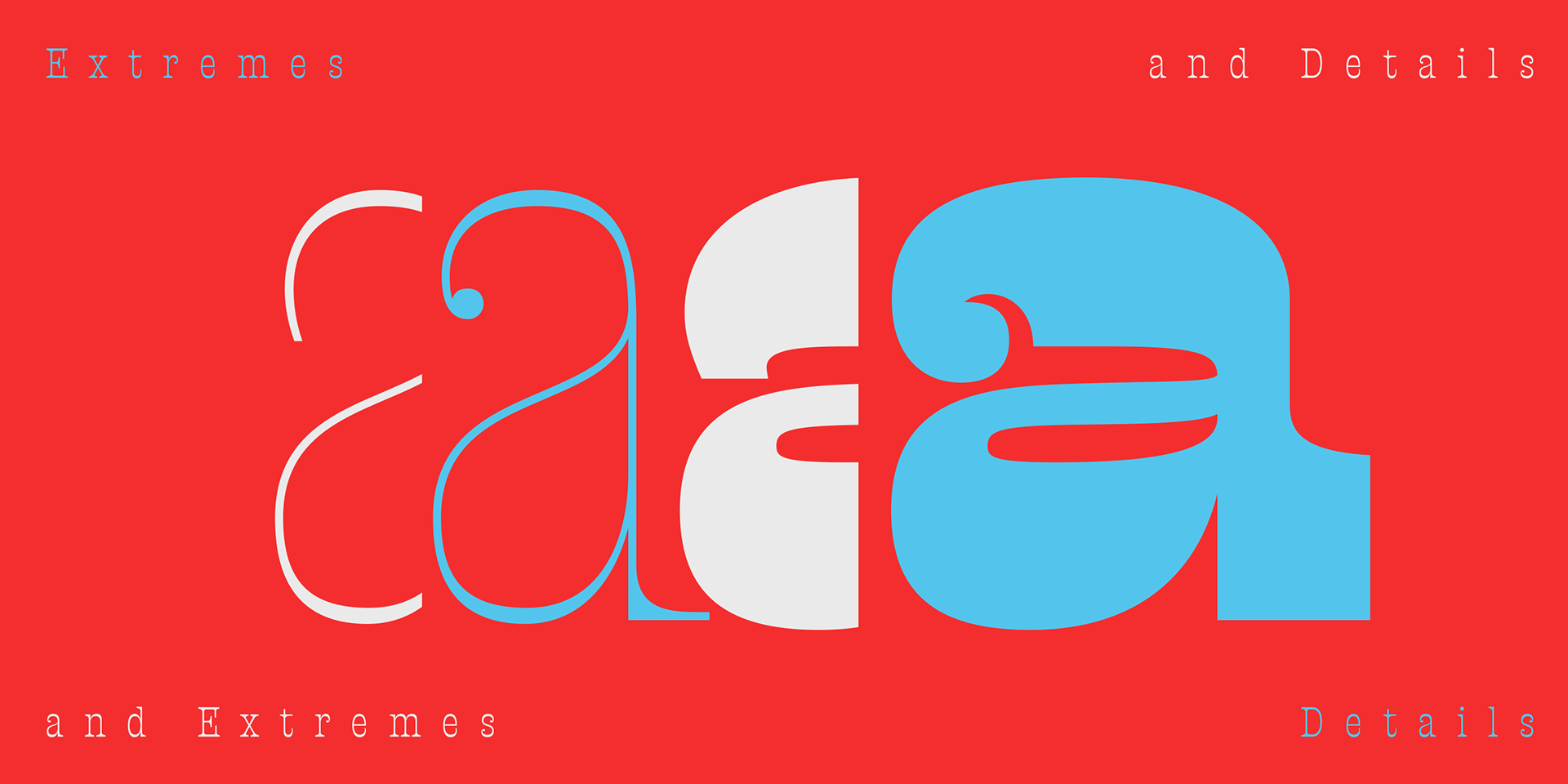
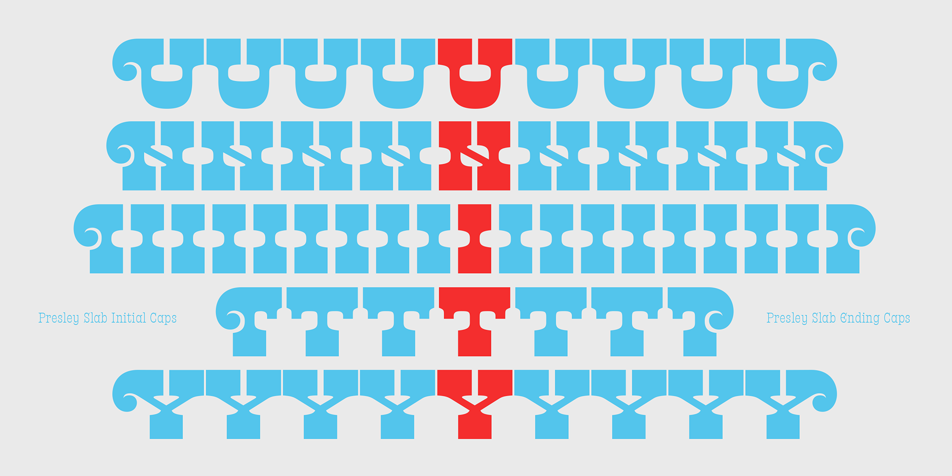
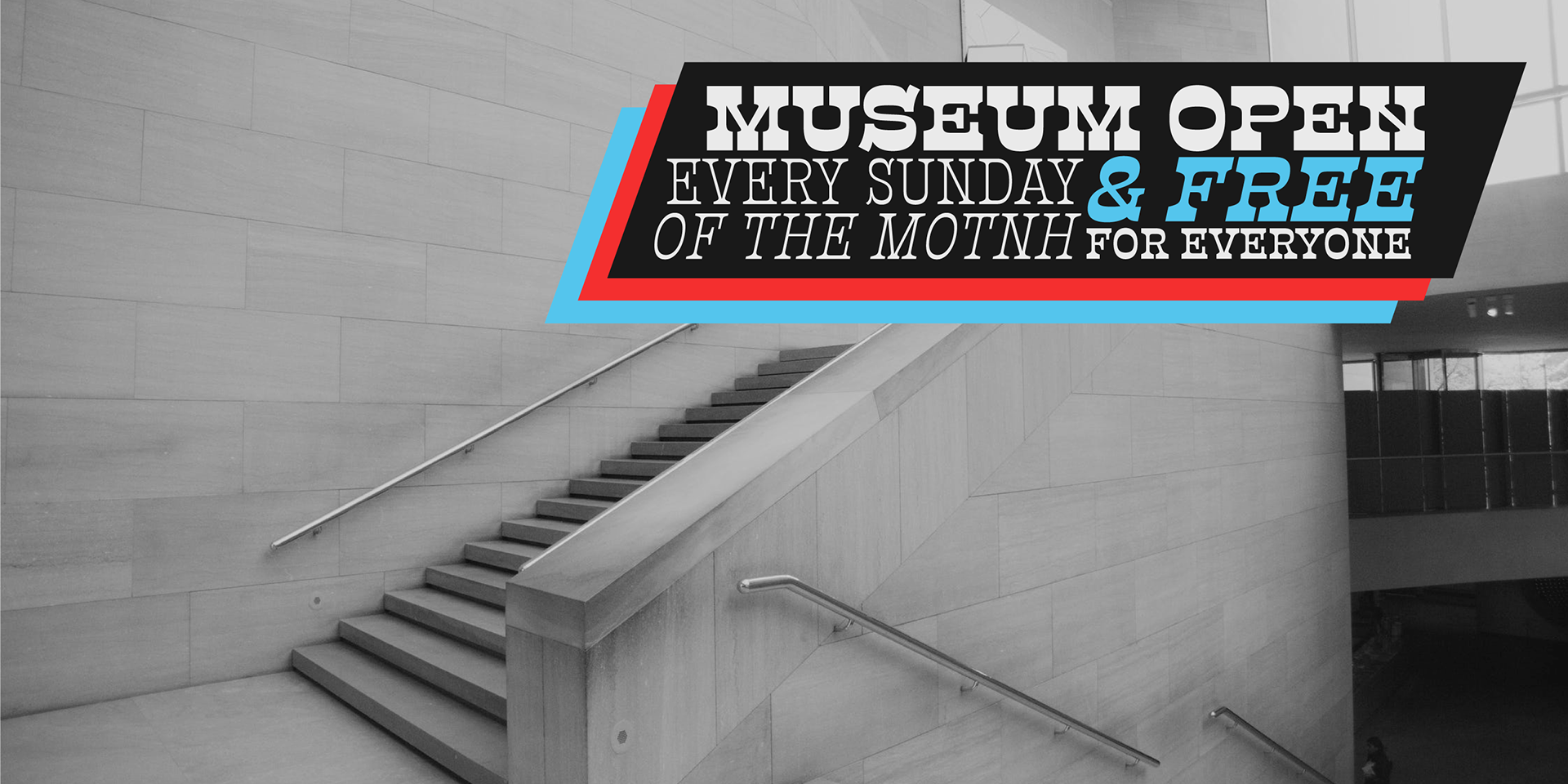
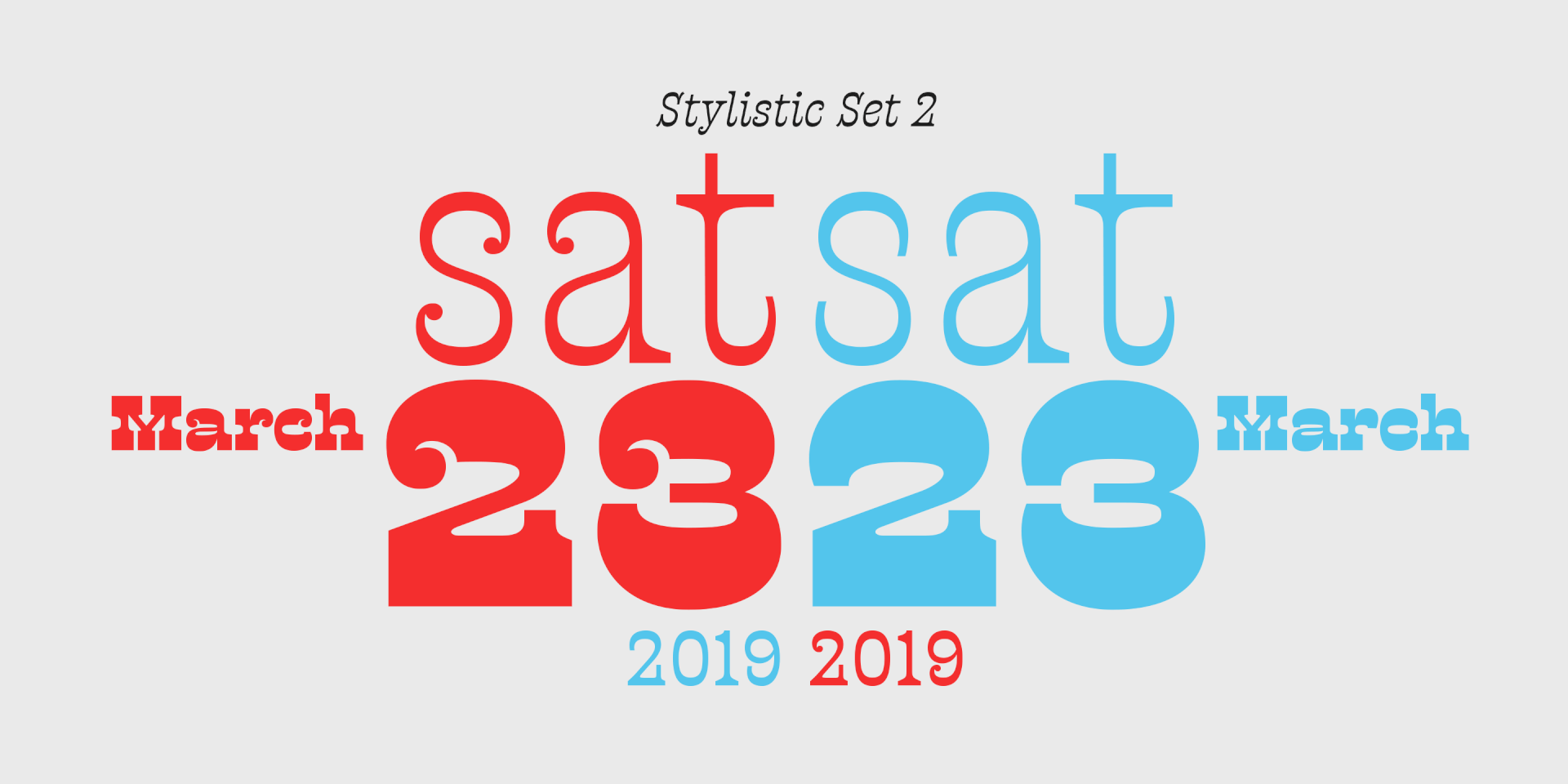
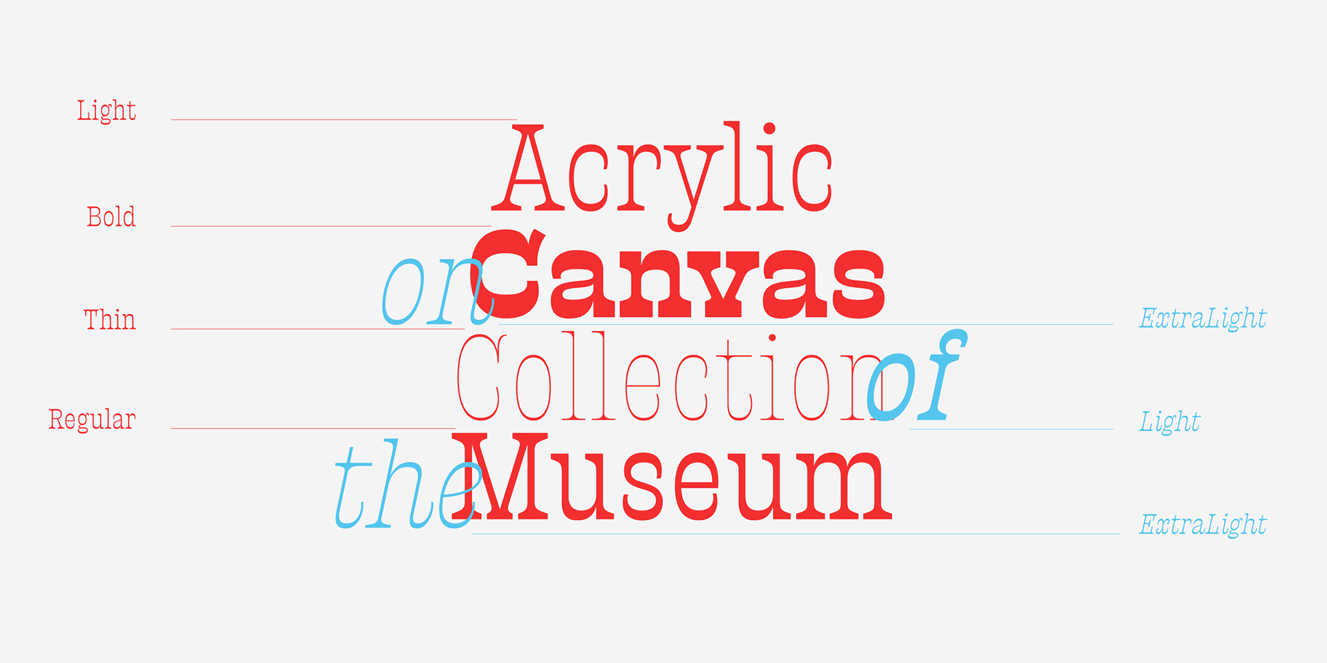
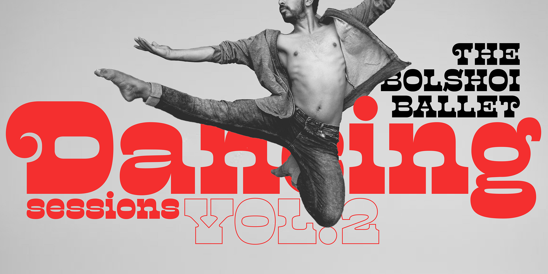
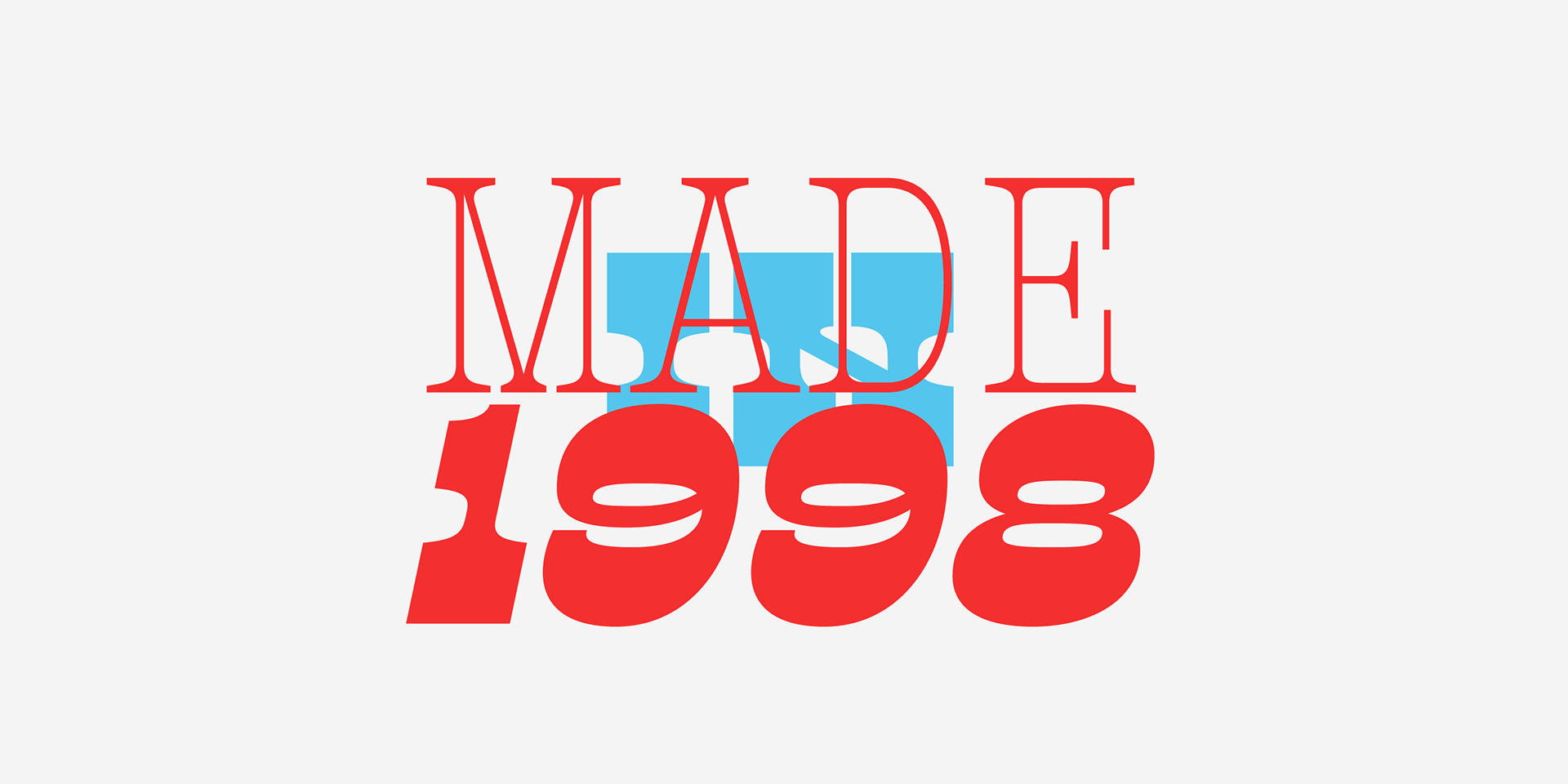
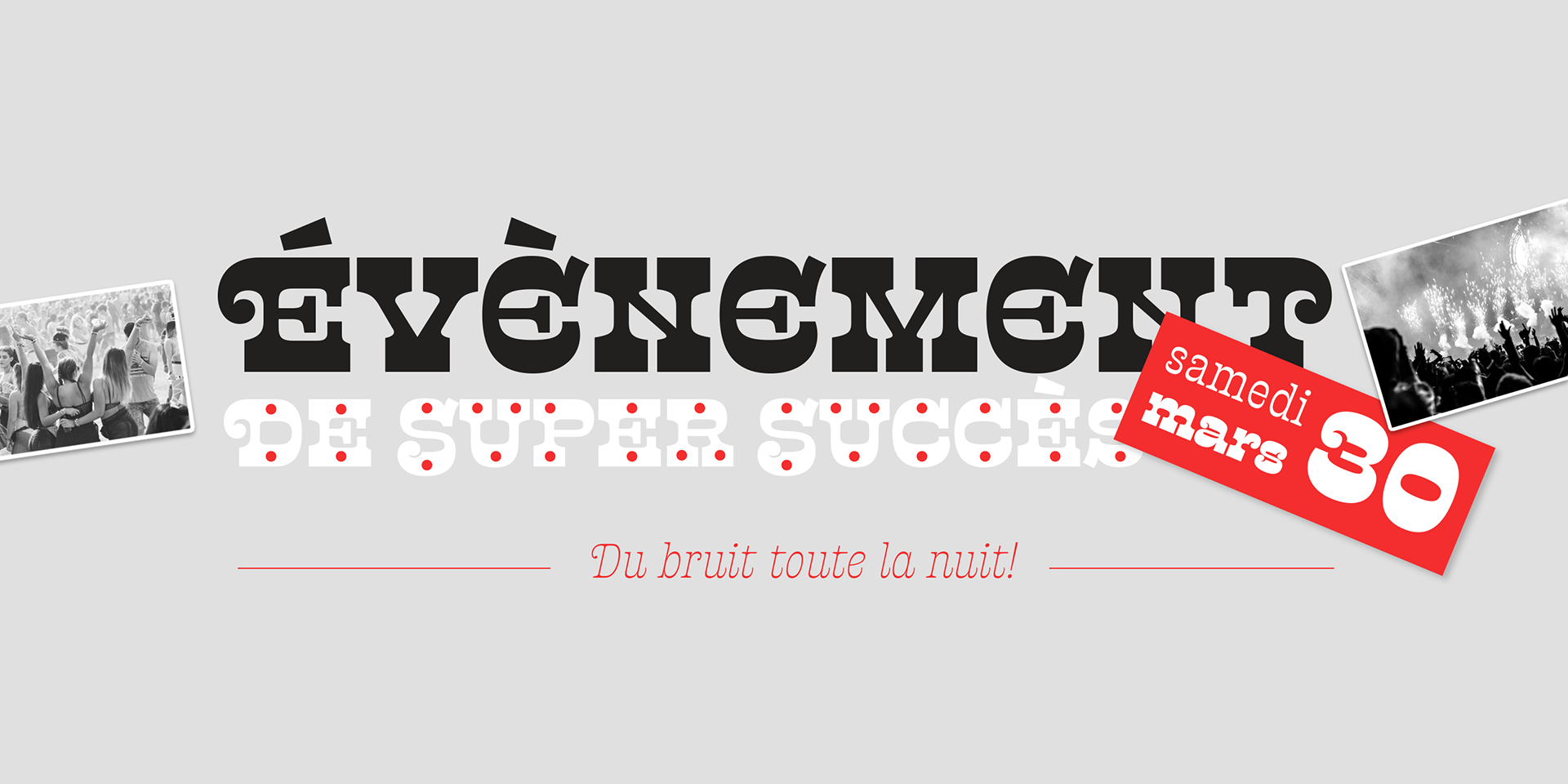
The lightest weight of Presley Slab takes inspiration from a late nineteenth-century type specimen, but what began as a decorative and delicate contrasted serif stirred Alejandro Paul’s imagination to conjure voluptuous reverse contrasted letterforms. These became the heaviest weight of Presley Slab, which nods to the lacquered hairstyles from the birth of rock ’n roll with its idiosyncratic ball terminals. Its playful allure and swagger remains visible in the weights that stand between these two extremes but as the curls loosened, many things happened in the design process including the appearance of swashes and alternates.
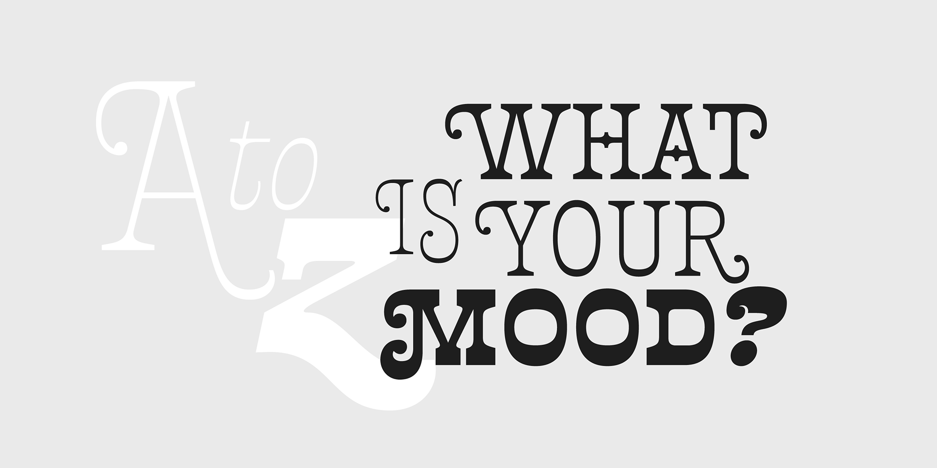
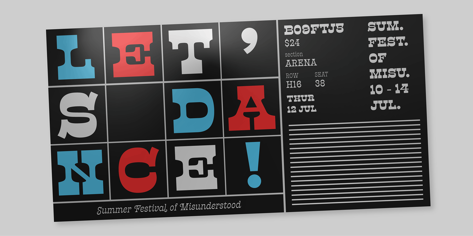
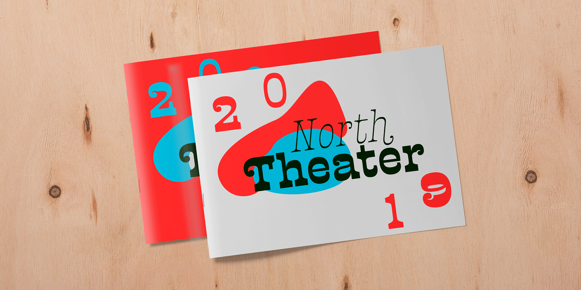
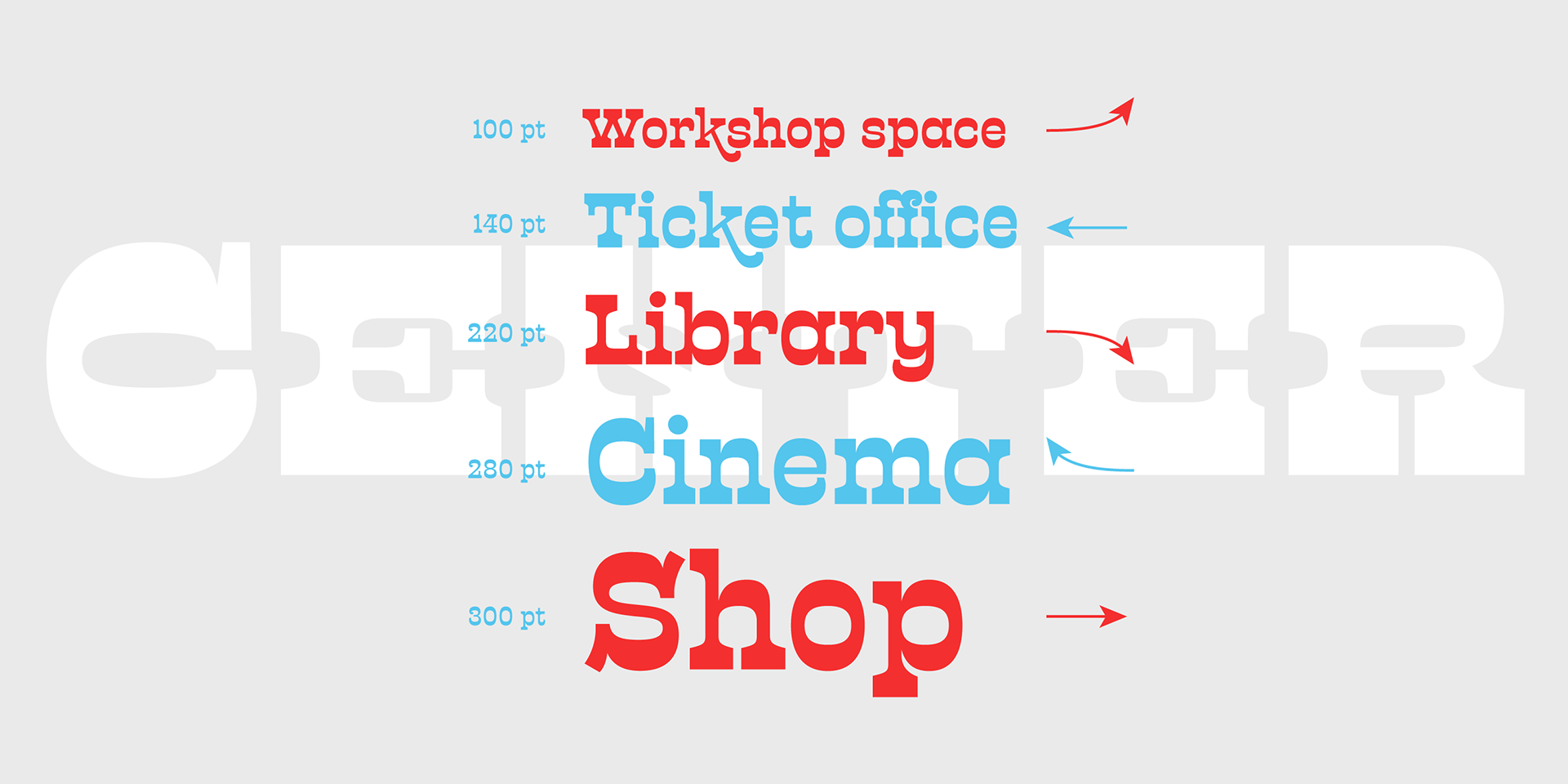
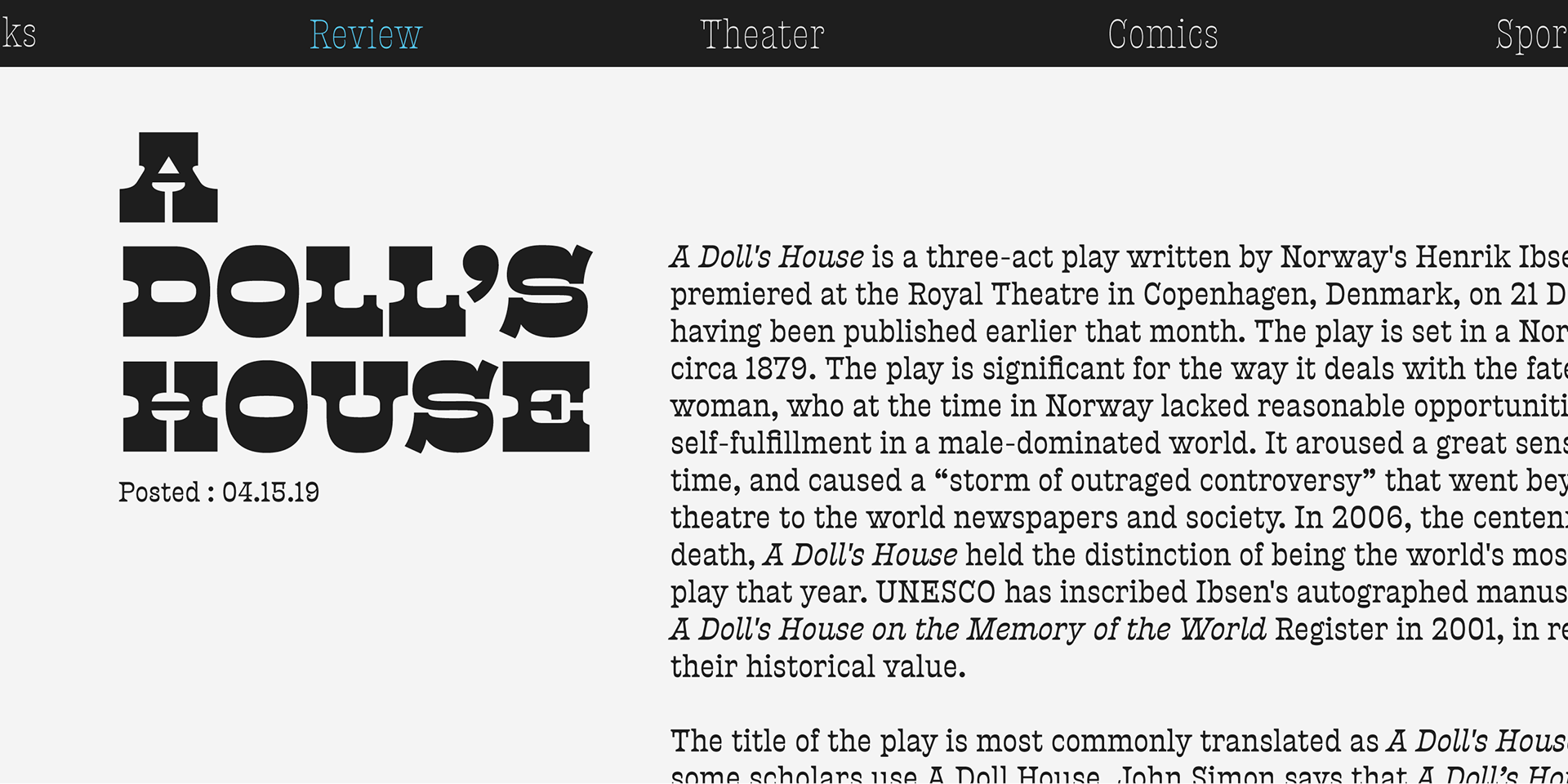
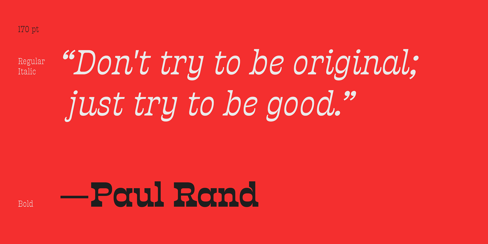
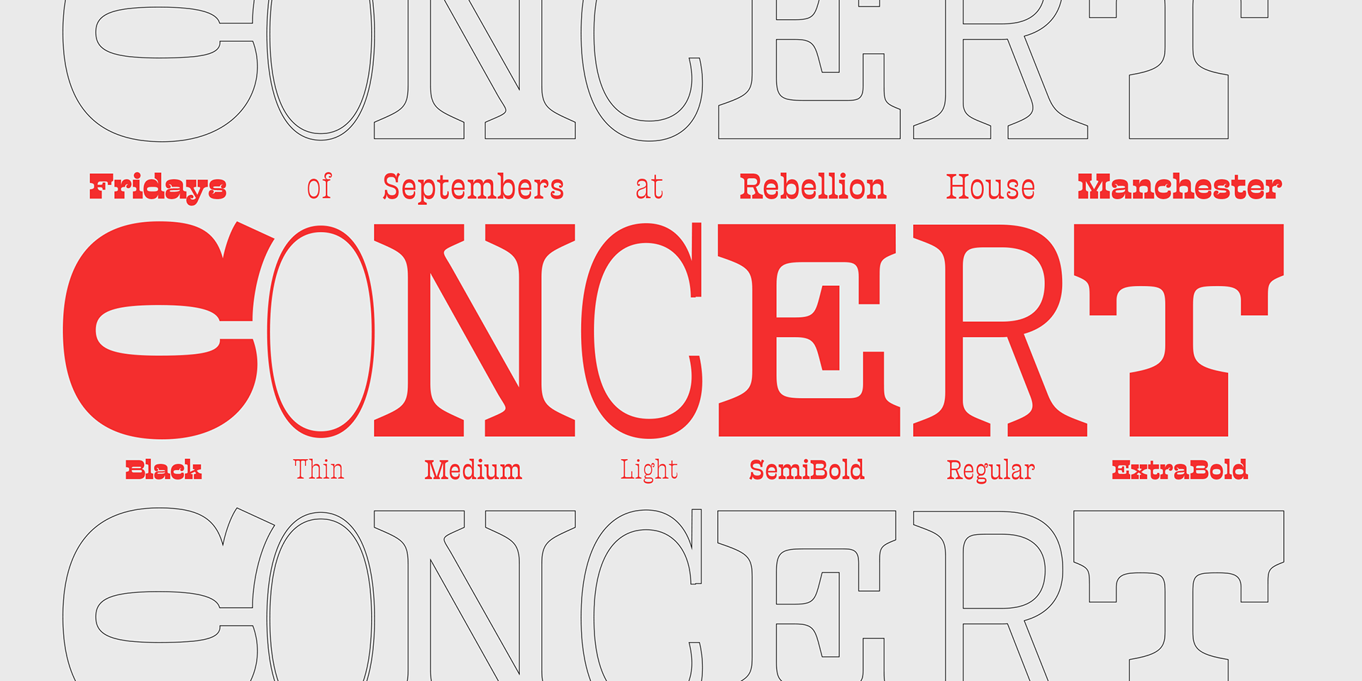
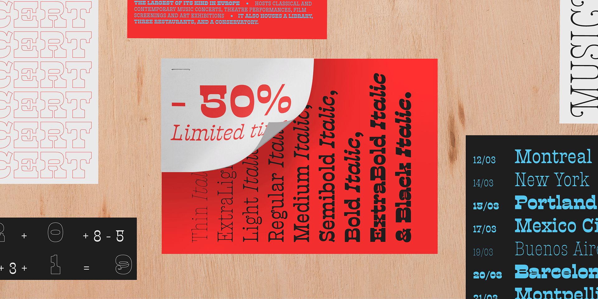
Presley Slab’s personality has breadth; it is a fun, confident and contemporary palette of letters that will perfectly perform for any job, from editorial design to branding. The Extra Bold and Black weights are a powerful option at large sizes for use on posters and billboards; the graceful Thin and Extra Light weights are delicate options for packaging design or fashion branding. Despite it conjuring images of mid-century music halls, Presley Slab is also staunchly European in it’s aesthetic, offering everything from good-humour to elegance with its unique touches.
Available now at Sudtipos.


Available now at Sudtipos.
Enjoy our introductory 50% off discount for a limited time only.
Get it here.
Creative Direction: Ale Paul.
Sudtipos team: Alejandro Freitez, Claire Menager.
Editor: Sara Snaith.
—
More fonts. Visit Sudtipos.