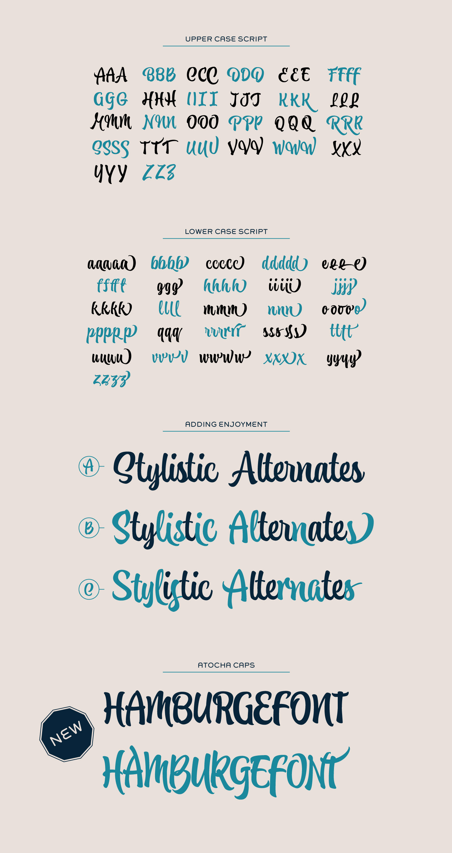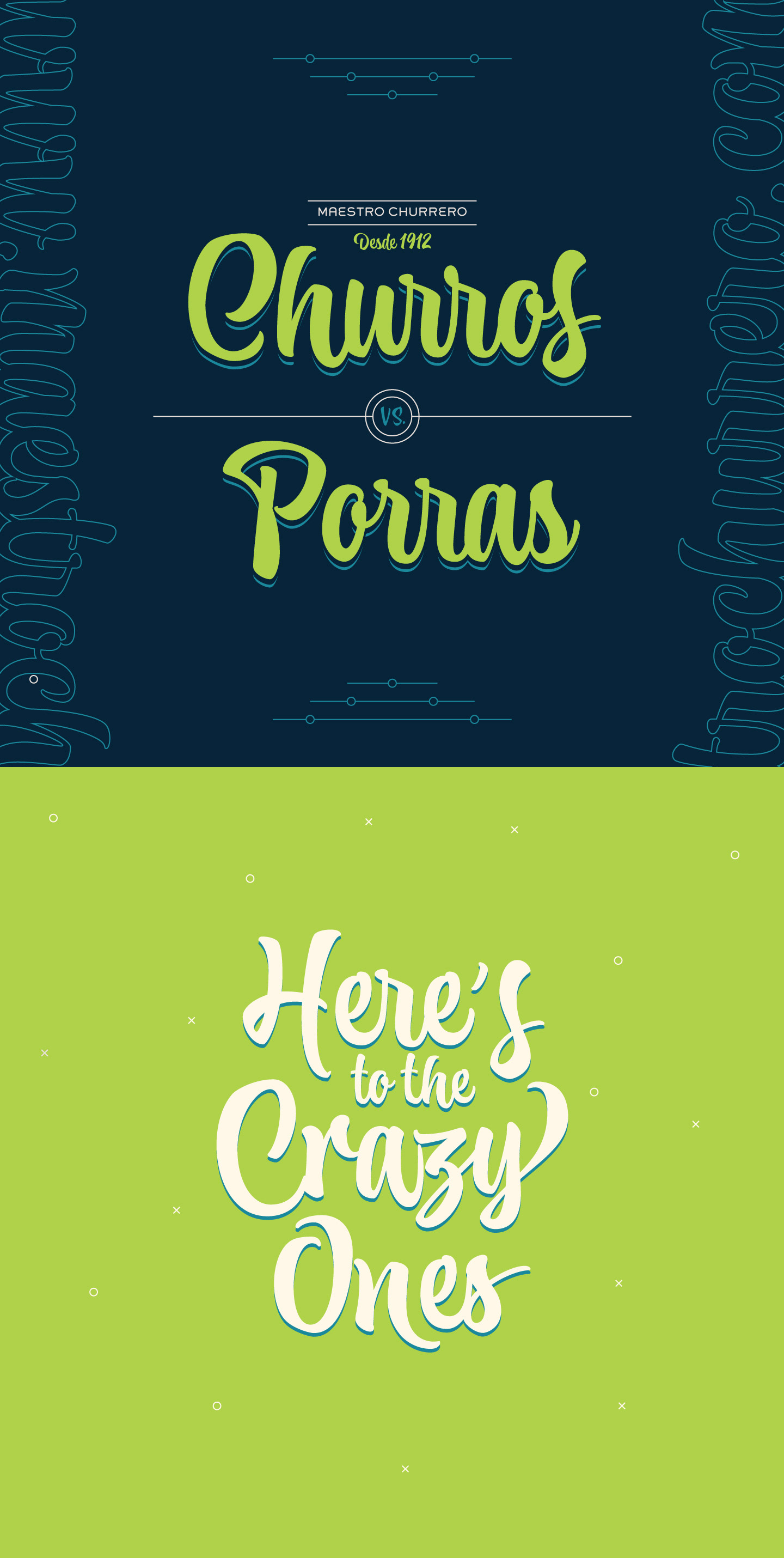
Atocha & Atocha Caps
Introducing a new typeface by Joluvian & Ale Paul for Sudtipos.
It was expected that Joluvian’s third type font would be inspired by the city where he currently resides: Madrid, Spain. His previous creations had originated in Venezuela (Zulia) and The Philippines (Salamat), both, places where he had once lived.
Joluvian believes “now is the time to pay tribute and show gratitude towards a city that has bestowed me with so many fortunes.” He considers that Madrid’s people, streets, scents, flavor and sounds are gift enough to awaken the creative urgency in any artist. This time around, it is being expressed through the crafts of the Typographic industry.
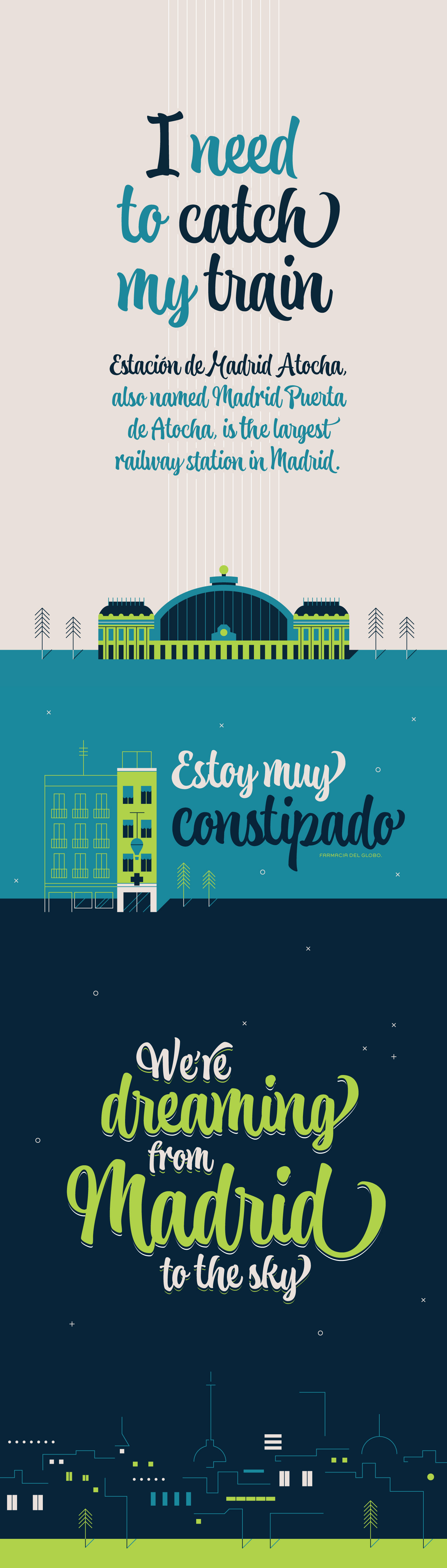
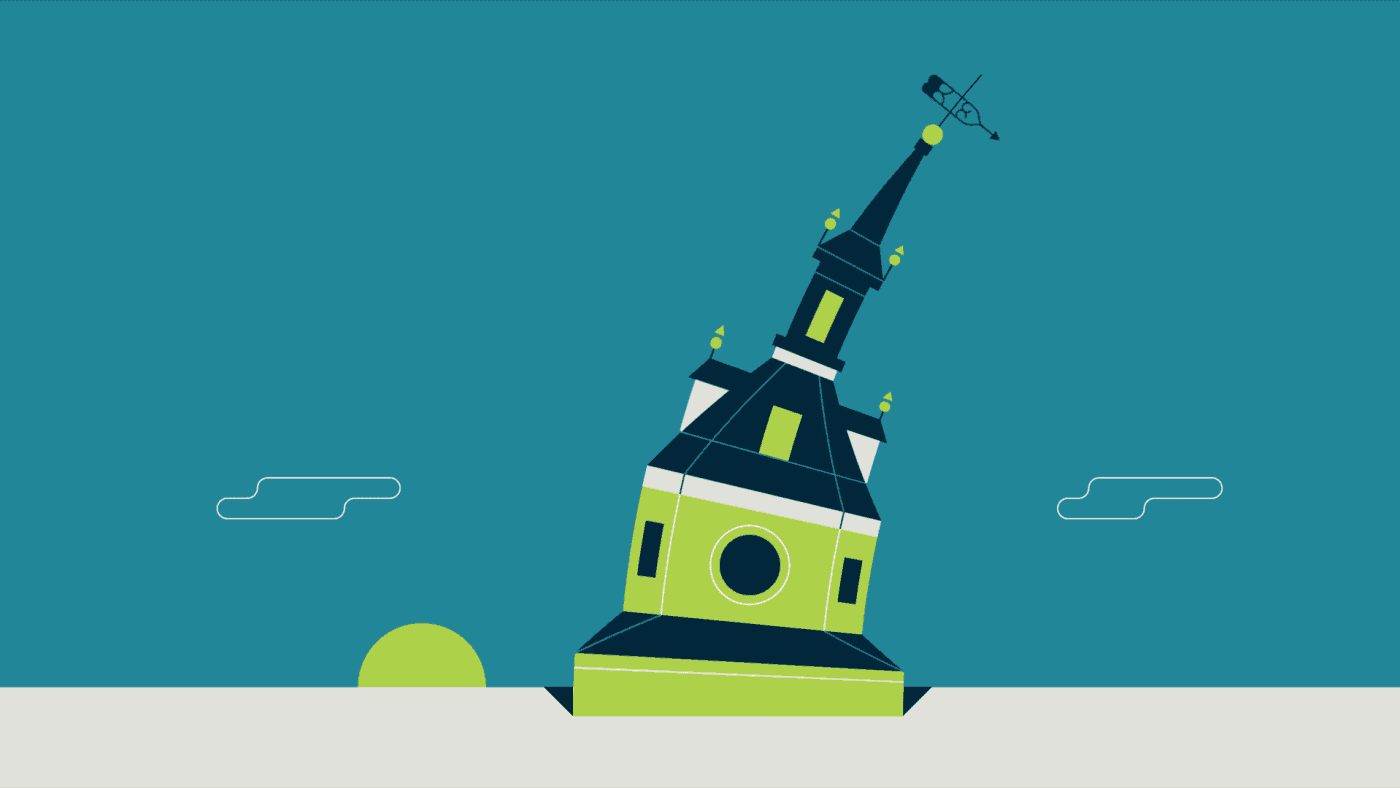
Since his arrival in Spain, Joluvian has been attached to the city’s central area, specifically to the renowned Atocha Street and its railroad station. It was precisely on that street that Joluvian and Mauco Sosa, his friend and partner, decided to establish the Patera Studio: a charming creative space that birthed the concept for this new font which they proudly named Atocha.
The artists where still in the final phases of their previous script, Salamat, when the idea for Atocha came about. This dynamic is actually very typical of the artistic process, in which every finished product spawns the need to create its next level offspring.
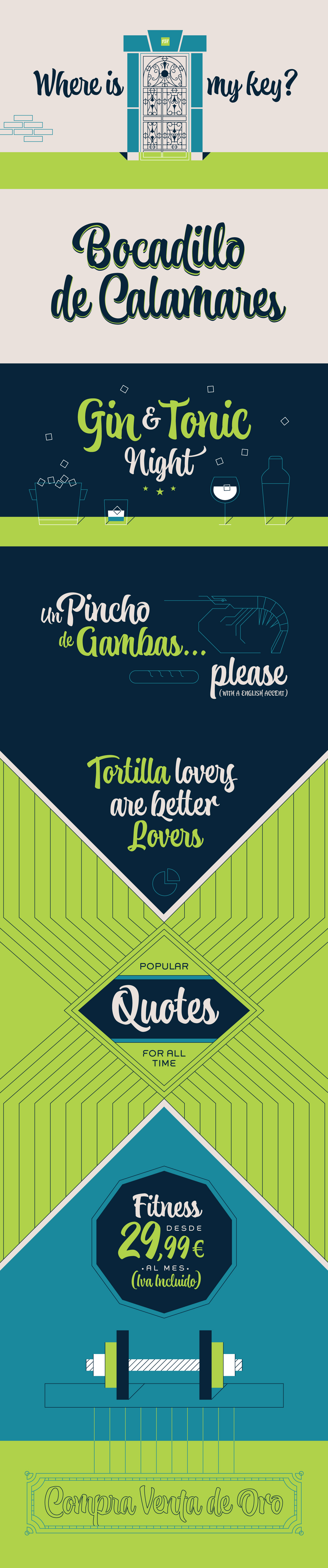
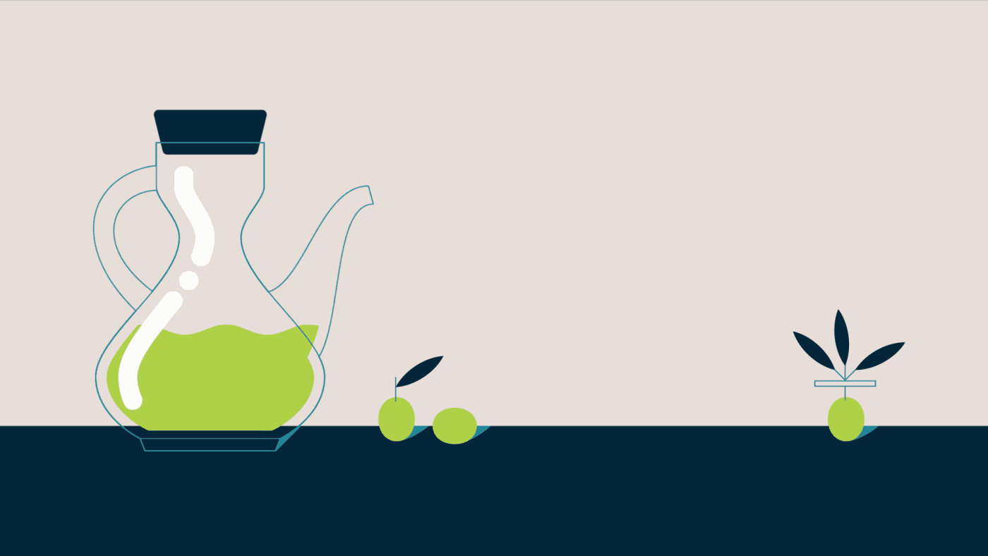
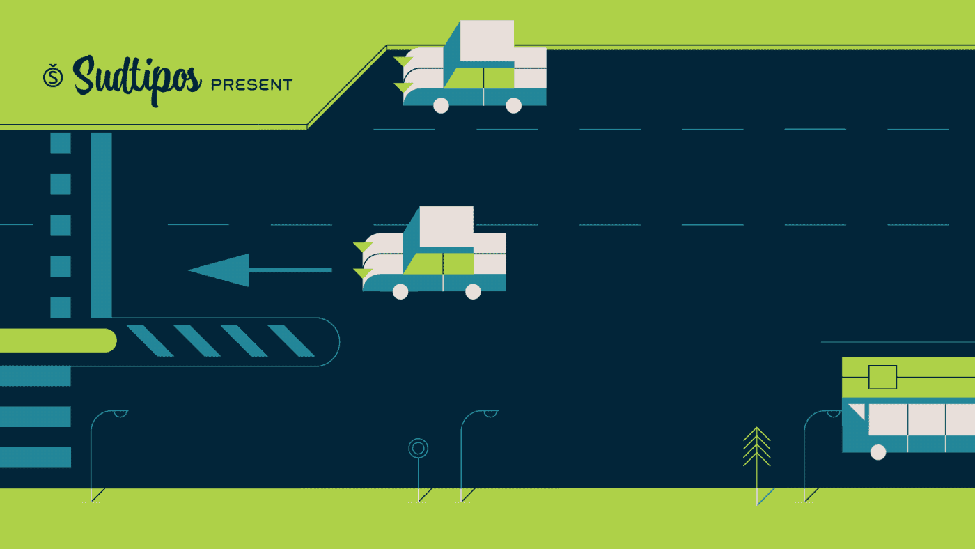
“Working on Atocha and Atocha Caps has been a very pleasant journey. We have given our best efforts, for we wanted to offer a typeface that was both versatile and user-friendly on a number of applications, showing a wide scope of alternatives in our glyphs,” says the artist. The illustrations were created by Mauco, to ensure visual integration that would showcase the work of both members of the Patera Studio and their complementing aesthetic voices.
--
Introduciendo una nueva tipo, creada por Joluvian y Ale Paul para Sudtipos.
Obtén la tipo aquí.
Era de esperarse que la tercera tipo de Joluvian tendría como inspiración la ciudad donde actualmente reside: Madrid, España. Las anteriores estuvieron originadas en Venezuela (Zulia) y Filipinas (Salamat), lugares donde el artista había vivido.
“Ahora es el momento de rendir homenaje y agradecerle de alguna manera a esta maravillosa ciudad que tantas fortunas me ha brindado,” cuenta Joluvian. Dice que sus calles, su gente, sus aromas, sabores y sonidos son obsequios suficientes para despertar la urgencia creativa de cualquier artista. Ahora es el turno del gremio Tipográfico.
Desde su llegada al país, Joluvian ha estado siempre muy ligado a la zona céntrica de la ciudad, específicamente a la popular calle Atocha y a la estación ferroviaria del mismo nombre. Precisamente en esa calle y después de varios años como freelancer, Joluvian y su amigo y socio Mauco Sosa deciden fundar Patera Studio: el espacio creativo y encantador donde surge la idea y el concepto de la nueva tipo que orgullosamente hereda el nombre Atocha.
Esta creación nace mientras se afinaban detalles de la elaboración de Salamat, la anterior tipografía. Es una dinámica muy típica del proceso artístico, donde observamos que una obra por terminar va dejando la necesidad de inventar un fruto posterior.
“Trabajar en Atocha y Atocha Caps ha sido una grata labor. Hemos puesto el mayor de nuestros esfuerzos, buscando ofrecer una tipografía versátil, amistosa y de fácil uso en diversas aplicaciones, mostrando como siempre un abanico de alternativas en nuestros glifos," dice el artista. Las ilustraciones han sido creadas por Mauco, integrándolas a un sistema visual y así poner en juego los dos estilos de los chicos de Patera.
• Obtén Atocha aquí •